Tag Archives: Apartment

Building Dramas Build

After we left our Vorabnahme, Kay immediately started addressing the bathroom problem. We could ignore all the other mistakes, but the grout problem and uneven thresholds could be the ruin of our carefully planned moving weekend. See… we have, in fact, cheekily scheduled a handover of our old flat the weekend after we get the keys, so if just one thing goes wrong and we have to wait… we will be homeless.

We emailed and called in the days after our visit and our contractor said he was working on it, but two weeks after our Vorabnahme, we were still waiting for our contractor to procure the piece of paper that said which colour of grout we ordered.

How long can it take to get a little piece of paper?

After 2.5 weeks the contractor finally confirmed that yes, the grout really was the wrong color. Then they wrote that since “we” are running short on time and this really requires a lot of work to fix, they wanted to know if we would accept the defects for a price reduction.

…and we’re supposed to agree to this without knowing how much that is?

I was frustrated that instead of offering us a quote when they are short on time for repairs, they were mainly asking if they could get out of fixing their mistakes. I could live with the problems for a certain price, but I wasn’t going to accept the defects just because the contractor messed up and didn’t think the flat would be ready on time.

After three weeks we finally received a quote… and it stunned us. Bathroom renovations start around 15-25k PER bathroom here. So I was actually pretty angry to find out that they offered us a whopping 400CHF.

Um. No. A few hundred francs is not how much it would cost to fix this. If WE would get someone in there for a quote to take down all the tiles and remove the grout (or replace the tiles entirely) and then to re-do all the walls and floor to be flat without breaking any of the other hardware or furniture in the bathroom, it would probably cost us 10,000-15,000 CHF per bathroom. Because labor is just that expensive in Switzerland.

We said “no thanks” of course and the next day the tiler “reevaluated” his quote and offered us  600CHF. Whoo.

Yeah, if it’s such a cheap (for Switzerland) fix, those guys are going to fix it the way we wanted it. And they are going to do it on time, or they’ll be paying for our hotel. We didn’t expect a crazy 10-20k quote, but I had hoped they would offer us something that was reasonably fair considering how much money it will cost them to fix it themselves. But instead they just tried to shave corners and chance saving money on their errors.

So four weeks after our Vorabnahme and four weeks before we move, Kay was in Mexico and I had to call the contractor and clarify if they are taking all the tiles down or just removing the grout. Calling people in German is nerve-wracking enough anyway, but our contractor has a very thick Swiss German and to me it sounds like he has marbles in his mouth. On his cell phone reception, I barely understood anything he said.

He *could* have said that yes, they are taking all the tiles down first as we prefer. But he also could have said no, they are taking down some of the tiles and others they will just take the grout out. I’m really not sure. He said a lot of “Oh it will be done on time according to the protocol.” Very assuring. Not.

I asked him if he could confirm everything in an email “so that my husband can read it in Mexico”. Cough cough. And because I could read the email and figure out what the heck he said!!

Anyway, understanding everything or not… it was clear that he said the place will be ready on time, according to the damn protocol. And you can bet your ass we are going to have a third party surveyor with us to make sure the “protocol” is up to standard before we sign off on our home!

Want to catch up?

Vorabnahme : Pre-acceptance Visit
Pre-acceptance. The point at which our new build was supposed to be “finished”.

It also marked the one official point during the building process where we could survey the flat and address any issues which must be changed before our contractor hands the key over in July. I had both anticipated and feared this day since we signed our sales contract in April 2012.

With only eight short weeks after our pre-acceptance appointment, we wanted the flat to be as perfect as possible without any glaring mistakes before we got to this meeting. This is the reason why we made sure to visit our flat as often as possible during building, so we could verify that no time-intensive or irreversible mistakes were made.
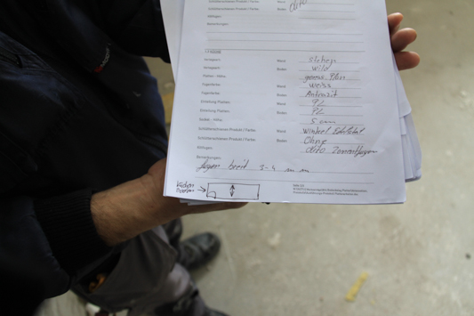
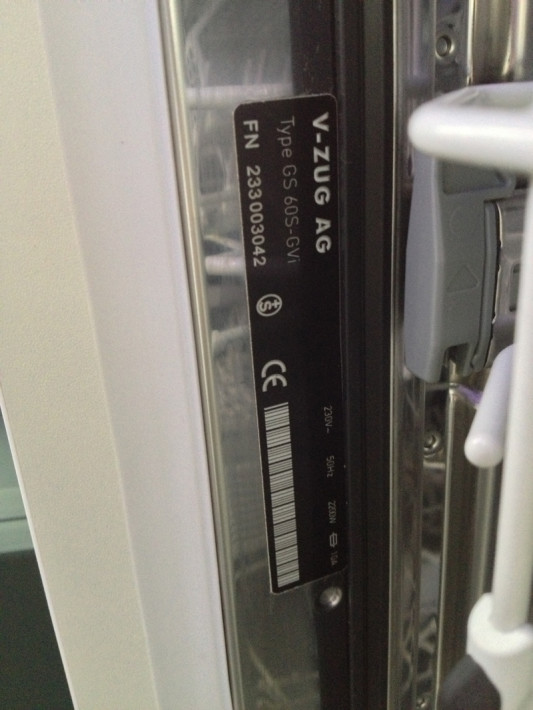
On May 12th, I stayed up late into the night preparing the list of all lists indicating the mark and make of almost everything in our flat. What color is the floor? Is it the right material? Is the fridge the right model? And so on… So when we started out in the kitchen on May 13th, I could open the dishwasher and check my list to see that it really was the correct model we ordered.

Yup. It was.

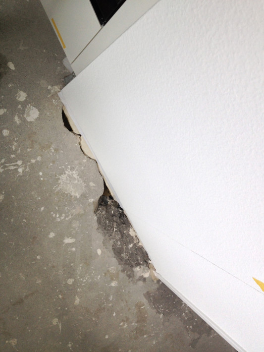
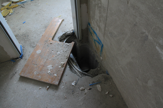
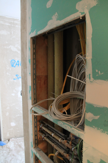
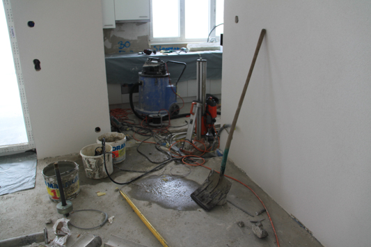
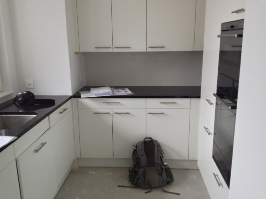
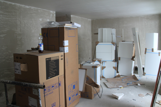
But not everything was finished. Our appliances were all in, but the kitchen floor and wall tiles were not yet installed. That utility shaft hole was also still in the process of being patched up. Hrrmph.

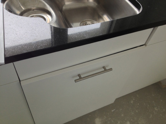
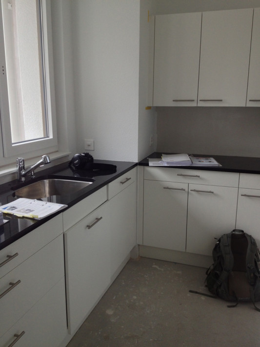
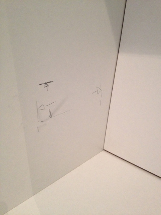
But our granite counters were in and they looked great. Below you can see that they still need to trim the cabinet door for the trash system to close properly.

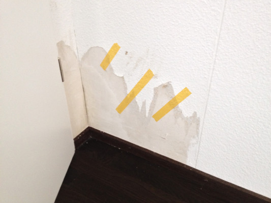
The contractor meeting us there (the one we kind of loathe for never answering our emails or calls and always going on holiday) walked around the flat marking cracks or wall defects that still need fixed. It almost made him seem useful! Below is the other side of the utility shaft from the living room side where we saw the hole before.

But other than not being finished, I was pretty happy with the kitchen.

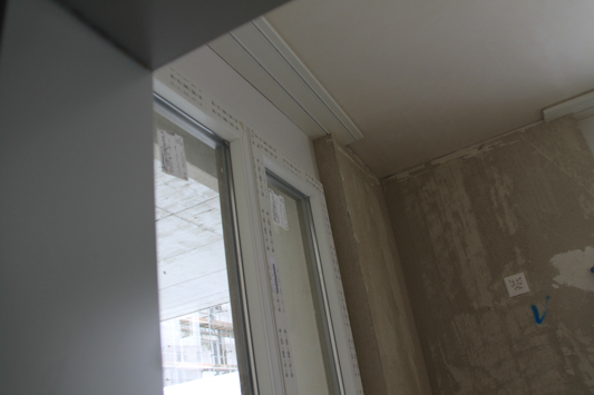
The electricity was not turned on yet so we couldn’t test that or the temperature controls. Nor could we test the air ducts in any of the rooms and because the window handles were not installed for security reasons (workers could leave them open and people could break in) we couldn’t open and test the windows. The shutters were also not installed yet.
Have you already noticed a growing list of things “not done” yet?

Workers actually were pretty lazy about installing the wood molding into the apartment and the screws are not flat. Many hang out quite a bit and could catch on something. They look shitty when you look at them from standing, but our contractor doesn’t think this is a problem because it is “within the tolerance”. We’ll see about that. I’m mostly concerned that if we think it looks shitty and we try to sell the flat to someone else, they’ll say it looks shitty too. And that would be a problem.

This is inside our built in wardrobe, where I mentioned to you last time we are expecting an outlet to show up at some point:

Yep, still no outlet there. But a nice little picture…

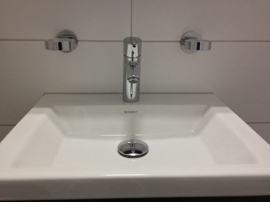
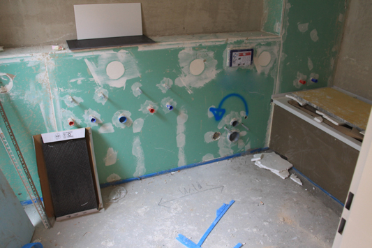
And the main difference from the last time we saw the house is that they have now installed the bathroom hardware for the soap dishes and toilet paper holders.

Almost there!

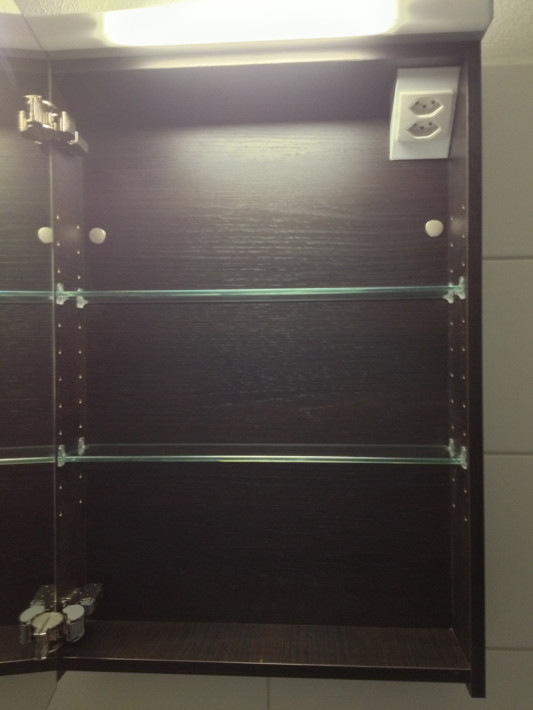
We checked the height of the hardware, opened mirrors and counted the shelves included. We tried to be pretty thorough, but the contractor was moving through the flat pretty quickly and with his assistant and Kay, we had four people trying to shuffle through all the places in the flat at the same time… it got a bit tight in the half bath and pantry!

For now, all the soap dishes and cup holders for the bathroom are wrapped up somewhere safe to be handed over when we get the keys.

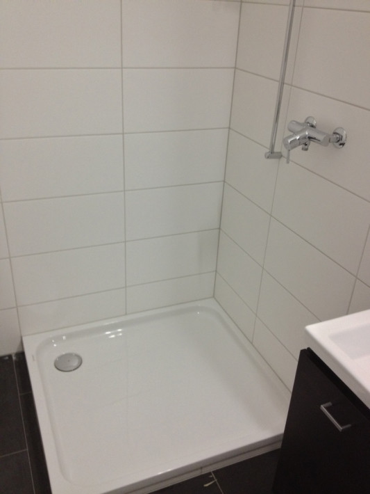
I was a little disappointed the glass shower cabin and towel rack are not installed yet. Something else to check later!

Inside we checked for outlets and shelves.

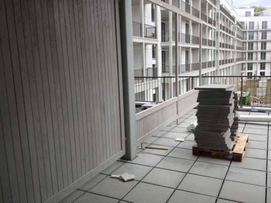
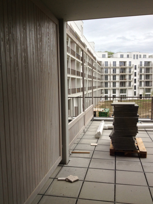
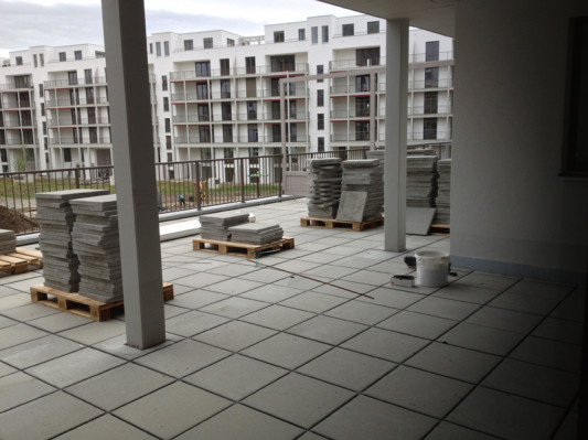
We couldn’t go outdoors because the darn balcony/window handles situation, so all the balcony doors were shut, but here you can see they are still in the process of laying the tiles and building up the privacy fences.

We have been told that fence should continue the rest of the way and not suddenly become so short. I really hope that is the case or we’ll get to know our neighbors very well… No sunbathing for me?

View from the balcony looking over towards the kitchen side of the flat.

The master bath. Oh the master bath.

By the time we got here we’d been through the kitchen, living room, hallway, pantry, guest bath, guest bedroom and master bedroom. It was actually the last place we visited and the first place we really noticed something huge.

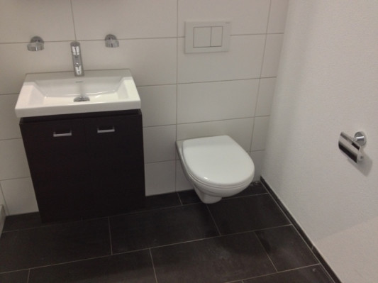
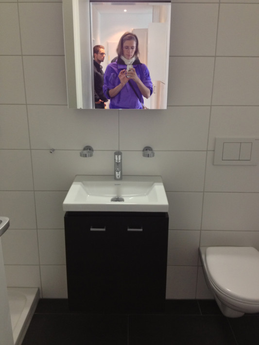
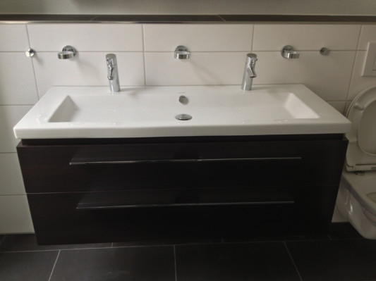
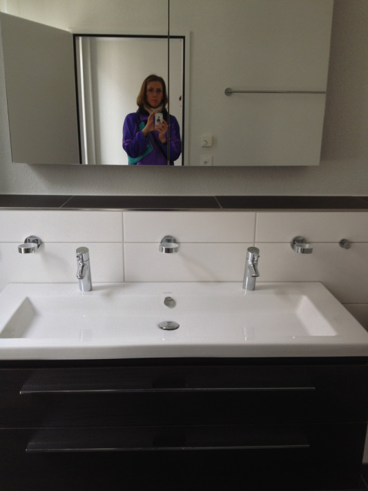
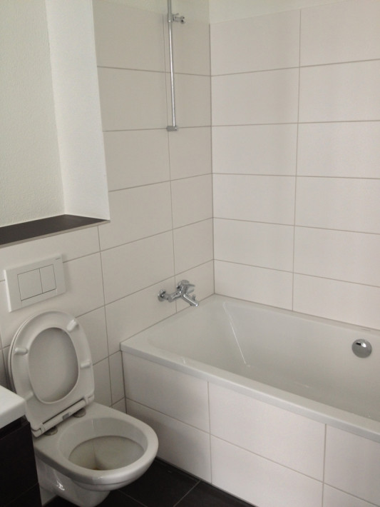
Here you see all our bathroom hardware in and it looks great. The whole bathroom looks great at first glance.

Then I look over here and check my all encompassing List. “Grouting color” I read. Hmm.

Hmmm….  HMMMM….!

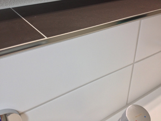
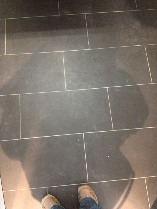
We were pretty specific about the bathroom and kitchen tile grout. We wanted white grout on the walls and black grout to match the floor tiles. You know… all light, all dark.  You know what those lazy suckers did?

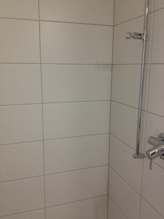
Yeah, they used light grey for everything. Fuck!

All of the sudden I was overwhelmed by this ugly grey grout. “No, no, no” I was saying. “This is not what we ordered.”

I went back and checked the shower, which of course was the same. Why didn’t either of us notice this when we visited the flat a couple weeks before? Re-doing the grout is a huge pain requiring lots of work for them to rip out all the tiles and redo properly. I really would have liked to inform them of their mistake as soon as possible.

Grey, grey, everywhere. Make it go away!

We actually wrote them several times about the grout color, called them on the phone and then Kay even went in person to the bloody tile appointment IN the flat to discuss which color goes where and how they lay it. We literally could not have done anything else other than to grout it ourselves (which wasn’t really allowed.) And they still screwed up.

Grrrrrrrrrrr. I took one more look at our problem and left.

We had a couple issues to deal with after our pre-acceptance, with the top three issues being our main problems.

1. Grout color wrong in all tiles (we hope to have them install the kitchen ones properly!)

2. Threshold from bathroom to bedroom or hallway is not even. Larger on one side than the other (measured with coins). Fixing this would also require them to completely redo the floor to make it even.

3. Wood molding: Crappy installation

4. Tiles not installed in kitchen yet

5. Some cracks and spots on walls here and there

6. Trash can cabinet not trimmed yet

7. The spots in the hallway were on but you could not turn them off. That might be because the electricity wasn’t turned on properly to the house yet.

8. Plumbing/Electricity/Air ducts all need to be turned on and checked

9. Balcony needs to be finished

10. Soap dispenser in kitchen needs installed.

11. Soap dispenser needs to be installed

12. Wardrobe socket needs to be installed

That was about it! The company would have eight weeks to fix all these problems and finish the flat before we move out of ours. If they don’t do it on time, they’ll have to pay for a hotel for us, so I’m sure they are itching to get done quickly!

Want to catch up?

Neubau Progress: Walls, Woodwork and Everything Else

Maybe I glossed over it in previous posts, but throughout the bathroom and kitchen upgrades, we were thinking about the overall look of the house the whole time.

The contractor gave us several cost neutral “free” choices and from there we could choose if we wanted to upgrade to a different material for our floors, kitchen cabinets, bathroom tiles, etc. It would be very easy to sink several thousand francs into upgrades, so we really tried to stick to materials included in our base price.

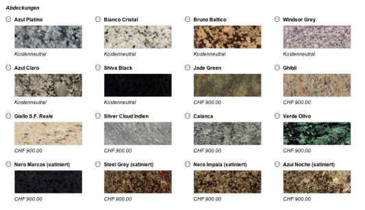
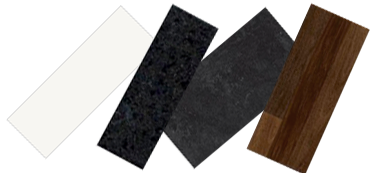
In fact, I was sure that from the granite to choose from below, we would go with Shiva Black because it was free and what we wanted (black), however, when we went to the kitchen store to view the granite in person, Shiva Black just looked… well, boring. We opted to upgrade to Nero Marcus (maybe not the version below) that had a much better texture and glints of texture that caught your eye in the sunlight.

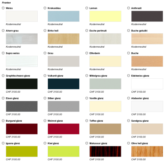
For kitchen cabinets we really kept it simple because not only would it cost a lot to upgrade all of them, but Kay hates cleaning our current super shiny “glanz” cabinets because they show every fingerprint. So for this we stuck to basic, Swiss white.

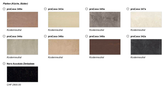
In the bathrooms and kitchen we would have tile and since, again, we did not want to spend a few thousand upgrading to complete black, we opted for the proCasa 342a below, which is a darker grey in reality. We figured that in the kitchen especially, having dark countertops and floors would be balanced by the white cabinets.

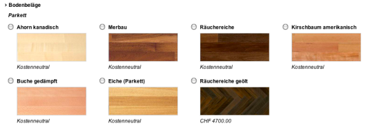
When I first saw the parquet options I knew that Kay would want “Eiche” and I would want “Räuchereiche” or “smoked oak”. But I didn’t think Kay would ever agree to such a dark wood, so I thought maybe we could settle in the middle with Merbau. Sure enough… his first suggestion was the Eiche, or oak.

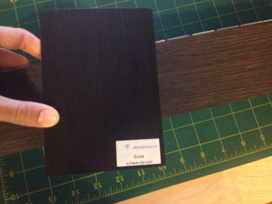
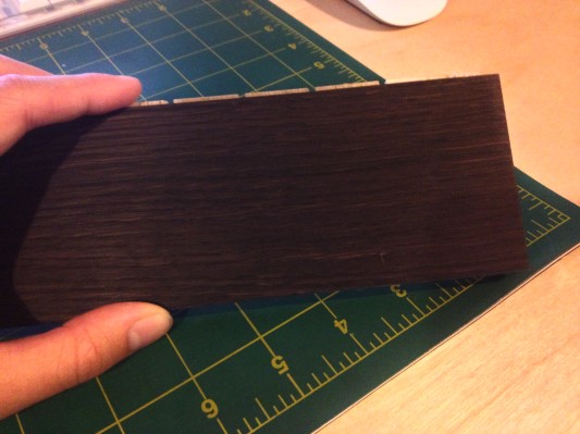
I was pretty set on Merbau until we actually saw it in real life. It was not nearly pretty as below. It was a cheap-looking wood with many dark spots and specs that I did not care for. Surprisingly, both of us agreed that our very favorite wood was the oiled smoked oak, which is available below in a fishbone pattern.

When we actually went to the flooring business they told us that for less money, we could have the oiled smoked oak without the fishbone, which Kay is not particularly a fan of. He thinks it is too old fashioned, so I agreed we should get normal grain wood.

The salesman explained the difference between laminated wood and oiled wood and we were pretty sold on the oiled wood. It’s more natural, easier to buff out scratches and you can re-oil and re-stain it over the years as it lightens. To be honest, all of the laminated cost-neutral options seemed kind of lame once we learned the benefits of oiled wood.

Above is our bathroom cabinets veneer with the wood. They’ll never be in the same room, but they are more or less in line with each other. The planks of wood will also be this width throughout the apartment.

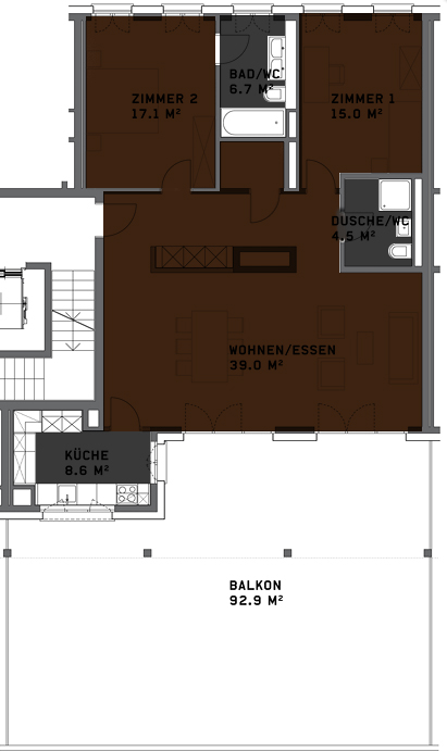
Below is the plan showing where the wood flooring will be installed and where the tiles will be installed. At first when we received our plan, they left the wood out of the pantry in the middle, so it was important to check that they put it everywhere they should!

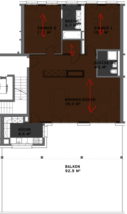
With the flooring salesman we also discussed which direction the wooden planks will travel in. We thought it would make more sense for them to travel down the length of the living room, longwise, but the guy explained that wood flooring looks much better when the light coming through the windows travels down the wooden plank, so we set up the wood to travel that direction in all the rooms.

Again, when Kay had the meeting with the tile guys he had them set up the direction of the tile in the same way as the wood flooring to match.

Our flooring choices are a bit dark, but with all the white on the walls and cabinets I think it will be a nice balance. Next we can decide if we really want to do a black/red/white theme like we did for our wedding or if we want to branch into other colors like teal, green, etc… Maybe some mood boards are in our future.

Lastly, when we decided everything for the bathroom we actually had to pick out a sink for the cellar washing area and decide if we wanted to spend a ridiculous amount on the drying system below. The answer is “no”. But we are “splurging” (or being swindled, based on how you view it) for the garage storage box because I think that will be important for anyone who has a car in our parking spot down the road.

So, that’s that. Besides worrying about my toilet paper holder, I think almost all of the flat decisions have been made at this point.

Want to catch up?

Neubau Progress: VII

I was really worried that after January, we wouldn’t be able to see our flat again until it finished in May, but in February, Kay visited the flat for an appointment with the tile guys in the bathroom.

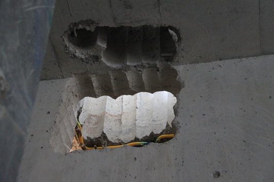
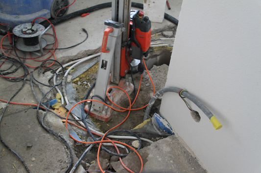
He noticed that in addition to the big hole we found in the kitchen, they had also drilled further into the hole outside the kitchen door. Not impressed.

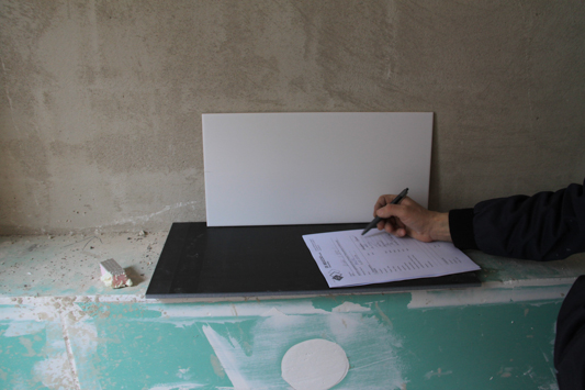
Kay met with the tile guys and told them which direction we wanted the tiles to go. We also decided that since they fit perfectly on the ledge, we would use the black floor tiles on the bathroom ledge above the sink as well.

Kay sent me pictures of how the tiles would be direction-wise and he explained to me that they would be setup subway style as opposed to straight grid lines.

Kay also asked me on the phone if I was really sure I wanted white grouting on the walls, because it would cost more. Yep. I want white, white, white so I can see any dirt or grout on my bathroom walls. I think we can spare the minimal cost of upgrading here.

We also specified that we wanted the darkest grout available for the floor to match the floor tiles. My mother always had a hard time keeping the light grout in her kitchen tiles clean so I definitely didn’t want that to be an issue for us.

The rest of the flat was still kind of a crazy mess. Since they drilled the utility shaft so late, everything was a bit behind in the kitchen installation. We were also exchanging our steamer to upgrade some more, at a special, extra additional cost on us… but whatever. I was going to get my temperature controls!

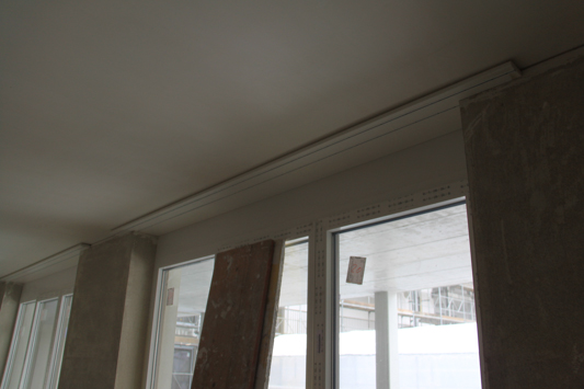
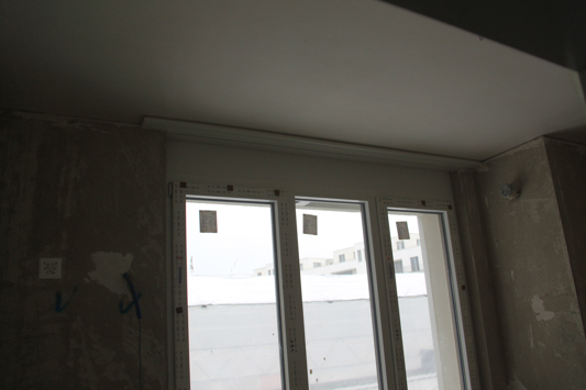
Kay also snapped a photo of our curtain rails.

Small details like this are something that the company sort of glossed over, but I would wake up in the middle of the night and wonder if we have to pay to install something ourselves or if it comes standard with the flat. I was happy to see them installed.

As you can see, they are the standard double curtain rail in Switzerland. We don’t normally have fancy curtain rods, but instead these minimalistic flush curtain rails with a track for sheer privacy curtains and another for heavier blackout curtains.

Our fuse box was still a hot mess.

Here they’d already marked on the floor which direction the tiles would be laid.

And since he was there, Kay went down to the floor below ours and checked our our kitchen hole from below.

Argh, just what are they doing in the kitchen?

I think this is the flat below ours where you can see they unfortunately had already installed the kitchen cabinets when they realized they’d forgotten the utility shaft.

Well well, no point stressing when there’s nothing we can do. We just had to wait and hope they patch it all up correctly… At least our tiles will be the right color and grouting after asking three times and going to this appointment!

Want to catch up?

Neubau Progress: Kitchen

Our first shared kitchen was a sink, hob and small counter top on one wall of our living/dining area, which actually seems big if you compare it to many New York City kitchens. I was excited when we moved to our current flat with its U-shaped kitchen off the living/dining area, I was very happy to be getting a huge upgrade in counters space. I mean, we’d even have room for our microwave! No more storing it on the dining room table! Hoorah.

At 8.6m2 (or 92.5 sq ft) our new kitchen will actually be much bigger than any kitchen Kay and I have shared during our relationship and while it is no American kitchen, I’m also excited about the size upgrade we’ll be getting in July.

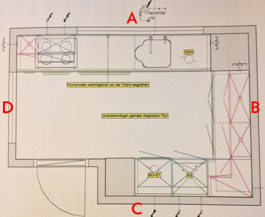
As you can see, the kitchen is actually its own room. Built into this little rectangle, we didn’t think it made sense to leave the door off and have an “open kitchen” because the kitchen is pretty closed off anyway. I admit that I’m looking forward to closing the door off from guests or sleeping spouses! (<- Usually that’s me!)

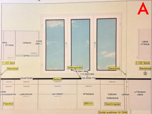
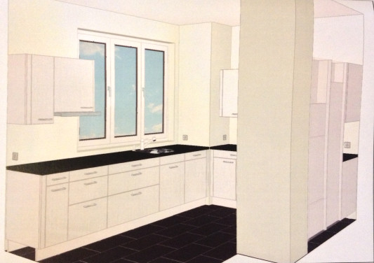
On wall A we have three windows looking out toward the inner complex, two of which will open and close (the middle one is stationary…) Our cost neutral plan came with some big drawers below the stove on the left, but we decided to upgrade the cabinetry below the sink to also be drawers because we think they’ll be handy and practical for pots and pans.

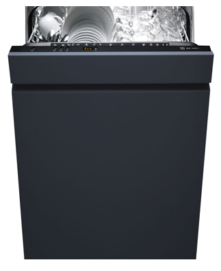
From right to left you have 3 sets of drawers, then the trash system below the sink and on the far right is the dishwasher. With the choice between Electrolux and V-Zug for kitchen appliances, we easily decided that we would go with V-Zug because the quality is much better.

Adora S from V-Zug

We opted for a slight upgrade on the dishwasher to one of the more eco-friendly models with a few extra modes of operation. It uses less water and electricity and it has fancy features like lights telling you when it’s done. The next higher option had a 19 minute quick clean cycle, but we didn’t think that was worth an extra 700 bucks.


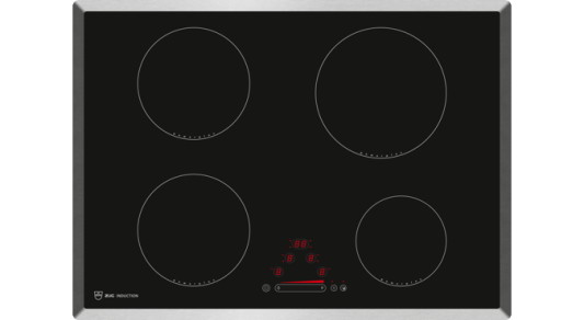
GK46TIXS stovetop from V-Zug

We did stay with the standard stove option. We debated for a few months whether or not we wanted to splurge for a ridiculously expensive wok setup, but Kay read reviews that the heating element below the wok would be flat, so it wasn’t really special to have the round wok setup anyway. That and we would have needed to re-do our range hood and cabinet setup. All in all, we stuck with the standard here.

DF-5 range hood from V-Zug

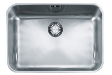
One of our bigger upgrades in the kitchen was actually with the sink. This is the standard sink that came with our flat:

Largo LAX 110 50 (35) from Franke

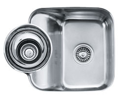
I wasn’t particularly excited about it and Kay’s parents raved about the sink they bought for their house, so they convinced us to splurge for this amazing sink:

Beach BBX 160 from Franke

Maybe it doesn’t look so amazing here… but it comes in a whole set with colanders and bowls that sit in the rounded part and a cutting board that wraps around the sink for easy veggie chopping/rinsing and a wire wrack to fit into the sink for washing.
Kay’s mother really raves about how well the sink empties and how easy it is to clean, so we splurged a bit here.
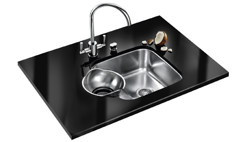
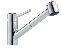
Another must-have in the kitchen was a faucet with a spray hose. We had one at our old flat and it is one of the things I miss most in Zürich. Seriously. So we actually “saved” some money by getting this extendable hose faucet on the right rather than a fancier stationary faucet. (Because I plan on cooking a lot in the new flat, yo!)

 Mambo from Franke

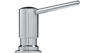
Kay’s parents also implored how important and how handy it was to have a dish soap dispenser built into the counter top. Personally, for 137CHF I thought this was something I could live without, but we are planning on selling the place sooner rather than later, so we went for this handy, but unnecessary feature. We’ll see how much I use it!

Nova soap dispenser from Franke

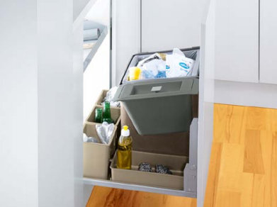
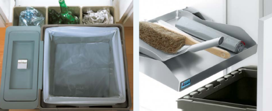
S+R 5101 from Peka-System

Every Swiss kitchen ever has the trash can under the sink. Our standar variation comes with a 35L trash can, 4.5L bio container and four bins for extras like recycling, trash bags, etc. It also includes a tray over the trash system to store other items. I am not the biggest fan of the “open” trash can system without a dedicated lid because in our current flat I feel like it stinks up the whole area underneath the sink, but since this trash system (and hopefully our complex) has a bio setup, I’m hoping we can put biodegradable things in the green container and empty it more often while leaving the 35L trash with non-stinky things.

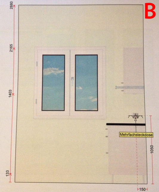
If you remember, I mentioned that we altered which side of the wall our kitchen door opens on and this was to avoid having the open door cover up the window on wall B. Kay really has his heart set on putting a breakfast table here, but I’m just not sure there’s going to be enough room with the walkway and access to the stove. “We’ll see…” I told him. 🙂

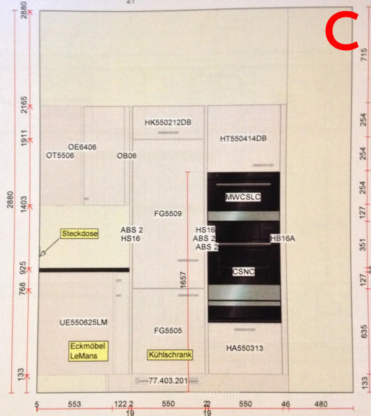
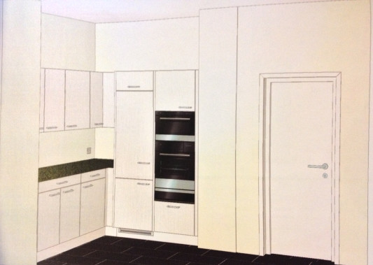
On wall C we have the ovens and a much larger fridge and freezer than what we have right now. Currently we are living with what would be considered a “dorm size” fridge/freezer in the US. I don’t know how I live with so few ice cubes… Seriously, the other day I didn’t have any ice in the house and it made me so anxious.

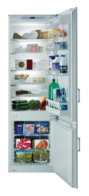
We upgraded the fridge slightly as well. There were three main V-Zug models to choose from, with the most expensive option having a decreased freezer area and a larger fridge area with a “Fresh Cool Zone” of 0ºC section for vegetables and meat. We (I) decided not to sacrifice actual freezer space for more fridge area, but we did upgrade to a slightly more eco-friendly fridge with a nice soft-touch close that will keep me from yelling at Kay to make sure he’s closed the fridge tightly!

Prestige Eco from V-Zug

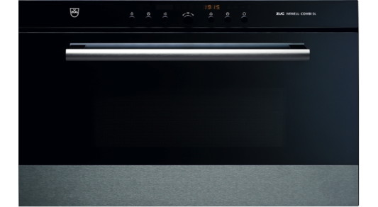
The place came with a planned steamer and oven, but we definitely had plans from the beginning to upgrade one of them to include a microwave feature.

Miwell-Combi SL from V-Zug

I’m happy we’ll have the integrated microwave so that I don’t have to dedicate any countertop space for it. Maybe that means the bread maker will win a spot outside the pantry!

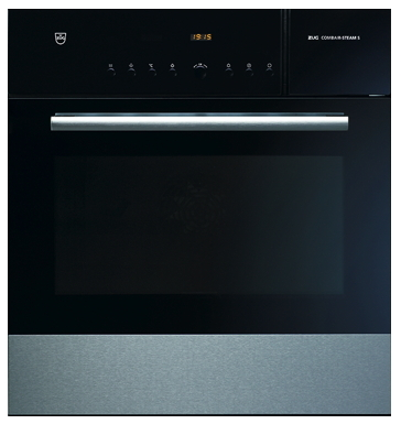
Combair-Steam S from V-Zug

After months of having things settled, I also decided that in the end, I did want the fancy built-in temperature control for meat in the steamer oven. Now when we cook things like turkey, we’ll be able to stick a meat thermometer into the oven and it will adjust the temperature of the oven until the meat is cooked to the desired temperature. The steamer oven also comes with a warming drawer so you can put your plates in there before serving food. 🙂

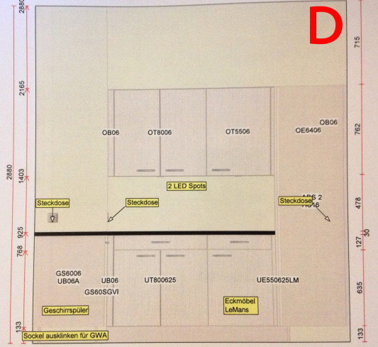
Wall D is where we decided we must add an electrical outlet in each corner so we can plug in coffee makers, toasters, blenders, and more.

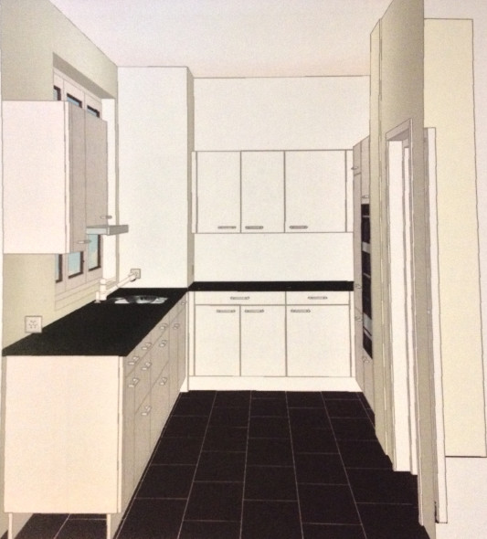
As you can probably tell from the photos so far, the kitchen place mocked up how our kitchen will look in our chosen materials. We opted for the very white, very Swiss wooden cabinets, white back splash and walls, dark black “Nero” granite, and dark, almost black tile on the floor. We also raised all the countertop heights by a few cm so they fit better for taller people. I find most of the standard countertop heights in Switzerland to be really short and uncomfortable to work at, as if they were made for petite people, which is strange considering how tall many Swiss are.

We wanted everything to be very classic, timeless and “Swiss” because we don’t want some neon green cabinets stopping people from buying our flat in a few years. I can’t tell you how many people had blue bathtubs and toilets in their houses and it was such a turnoff.

I was so excited to see the 3d model of what our space will look like. It’s nothing too crazy, but I think I’ll really like this kitchen. The only thing that disturbs me is that the cabinets don’t go to the ceiling, so I know I’ll be up there dusting from time to time. But adding extra cabinets to fill up the space would have cost an arm and a leg, so we’ll wait and do that for a forever home.

Kay and I debated a bit about the hue of the LED spots, but finally he gave in and let me have my warm red tones instead of the blue tones, under the condition that he can put blue toned LEDs in the living room. I just didn’t think blue hues make a kitchen and the food look inviting!

With any luck, I might be able to work a small 60cm X 60 cm bar table in the kitchen for Kay to have breakfast at on the days he gets up by himself…

Want to catch up?