Tag Archives: floor plan

Swiss Wardrobe Quotation (Eeek!)

Whelp, after I sketched up those wardrobe ideas, we received the offers from Dogern. They are so professional they also give you some simple renderings, which easily impresses me.

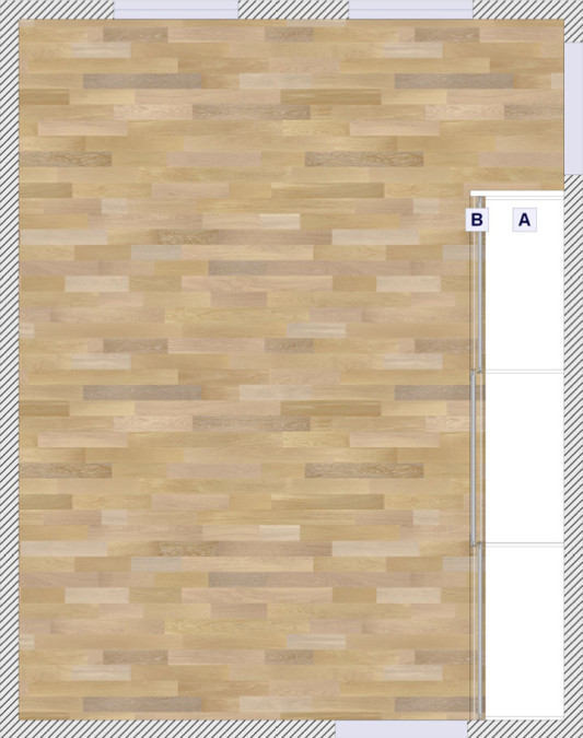
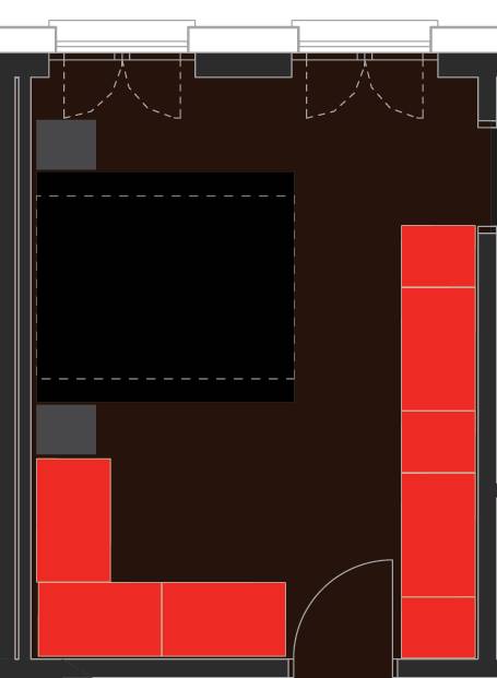
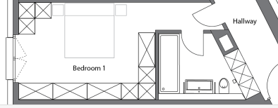
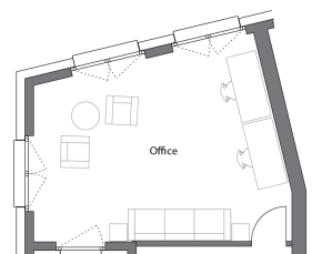
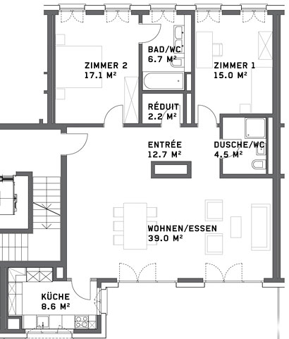
If you’ve forgotten, here is our bedroom floor plan. Our floor is darker of course. Two windows on the top wall, the bathroom door on the upper right wall and the door to the rest of the flat on the bottom wall.

We plan to make just one wardrobe now and possibly (depending on cost) supplement with a dresser or two on the other walls.

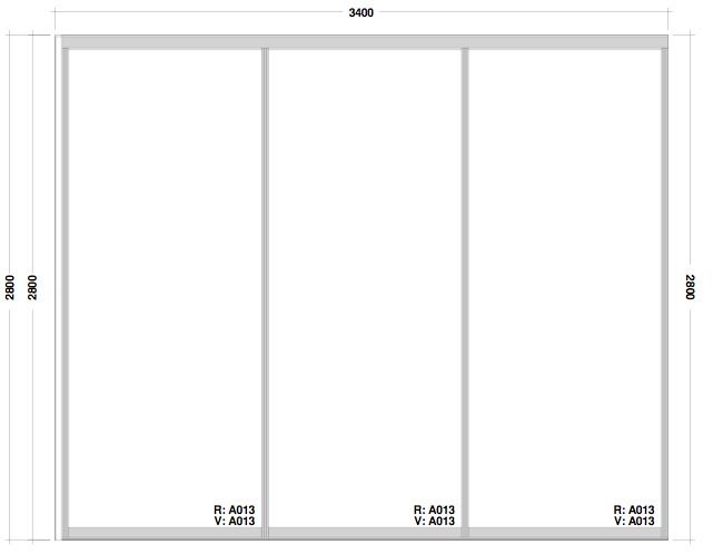
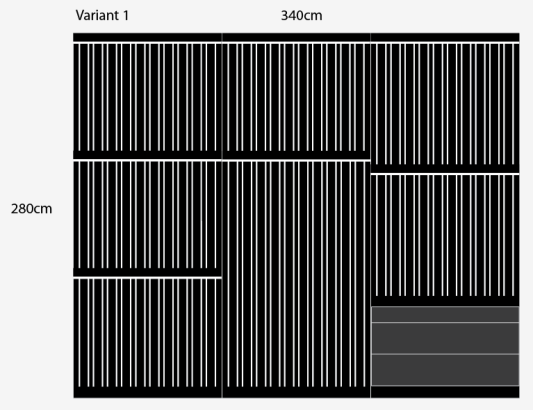
Frameless Doors:

These Noteborn doors are so nice. The frameless adds a very elegant touch and makes the whole wardrobe blend seamlessly into the wall. They are our favourites, but we weren’t looking forward to finding out the price.

Matrix Doors:
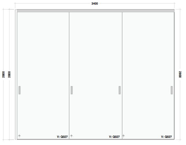
The Matrix doors are a little more clunky and have a frame running around each individual door, so if we choose white doors to match the walls, the doors will be broken up by the lines of the frames in each section.

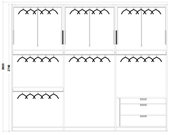
Option 1:

The idea of option one is to save money on those expensive, expensive drawers and just go for hanging space and using drawers where we can’t fit any more space. The reason why I haven’t made it completely hanging space is that Kay’s clothes (shirts and pants) are all fairly longer than mine, so on his side (on the right) it’s not quite long enough for three rows of shirts and pants to fit. On my side (the left) I think I can squeeze one more row in for maximum capacity!

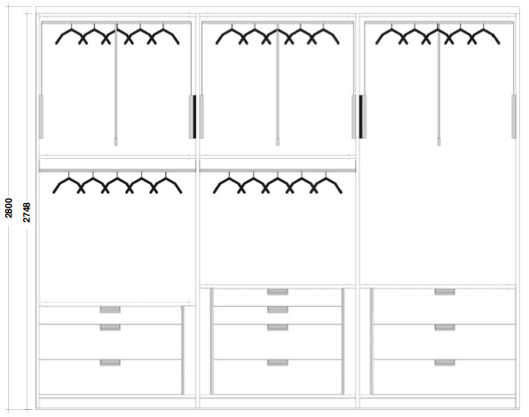
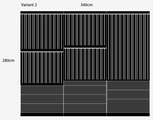
Option 2:

On this version we stick drawers in each section. It cuts down on the hanging space but in general should be as much or more space than we had with our old wardrobes in Zürich. And we have lots of drawer space for pullovers and pants and things.

Again I made Kay’s section (this time on the left) have more space for larger/longer clothes and on my side (this time in the middle) I put extra drawers in.

Prices:

  • Option 1 with Matrix doors: 7225CHF ($7871)
  • Option 1 with Frameless doors: 9458CHF ($10,304)
  • Option 2 with Matrix doors: 10049CHF ($10,948)
  • Option 2 with Frameless doors: 12420 ($13,523)

Yes, yes those are some crazy prices. But I’m afraid we’ve looked at almost every custom wardrobe place along the border in Germany and in Switzerland and this is way cheaper than a lot of other offers out there. It would have cost 20,000 or so to do two wardrobes, which is why we are either doing one or supplementing with dressers.

It costs an extra 2300CHF ($2500) or so to get the frameless doors, so as much as we love them… no. I just can’t. Not for a non-forever home at this point in our lives. It would add to the value of the house, but we really don’t have the money right now and I don’t want to live most of the time here with nothing just so we can get something nice for a year or two before we leave. That’s not smart!

As for the price difference between having tons of drawers or going for the supplemental dresser route, we are debating whether it’s worth it to save 2824CHF ($3076) and use some of that money to buy a dresser or two and have more storage. We would just need to find some dressers we like, which isn’t so easy in Switzerland!

Were you ever surprised how expensive it is to do something custom in your house?

Planning Wardrobes/Closets

Before we met with the guys at Dogern, I had an idea of where we might want to have wardrobes so I sent over this floor plan of our room and where the wardrobes could go.

In the end, Kay and I decided that we probably don’t need all that wardrobe space and that it would be better to keep that corner by the bed free of any built in wardrobe. If we really need extra room we can buy a dresser in addition to the main wardrobe, but I told Kay it would be smart to keep it free. If Kay is studying abroad some day, there is a vague possibility that I would want a roommate if I stay in Switzerland by myself, so I thought it is smarter to be able to fit a desk in the bedroom if I need to put on in there.

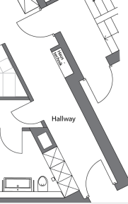
It just keeps our options open, which I like. Plus I’m having trouble convincing Kay we should put a giant mirror in the hallway to cover up the utility panels, but he seems more open to putting one on the wall by my side of the bed.

Since I know we have to have three sections in the wardrobes, I wrote the wardrobe guy that we would like offers for two options.

Option 1:

The idea of  option one is that we give ourselves tons of hanging room utilizing lifting clothes hangers and then have an additional dresser on the other wall so I can store my socks, undies, etc all. This would also be a cheaper option because it has less of those €250-a-piece drawers.

Option 2:

The second option still utilizes raising hangers at the top, but it has a bunch of drawer space at the bottom so that we can fit all of our clothes into the wardrobe, not just the hanging ones.

I’ve asked to have prices for option one and two with and without frame-less doors. Going frame-less would look wonderful, but I’m afraid the cost will be too high, especially for option two with all its drawers. The more we talk about it, the nicer it would be not to have a dresser, but Kay hasn’t seen any with me so I’m a little unsure about that too.

Did you have a lot of indecision trying to figure out your wardrobe situation? Or are you still living with “meh, that works” situation?

Thinking like an architect

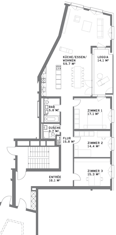
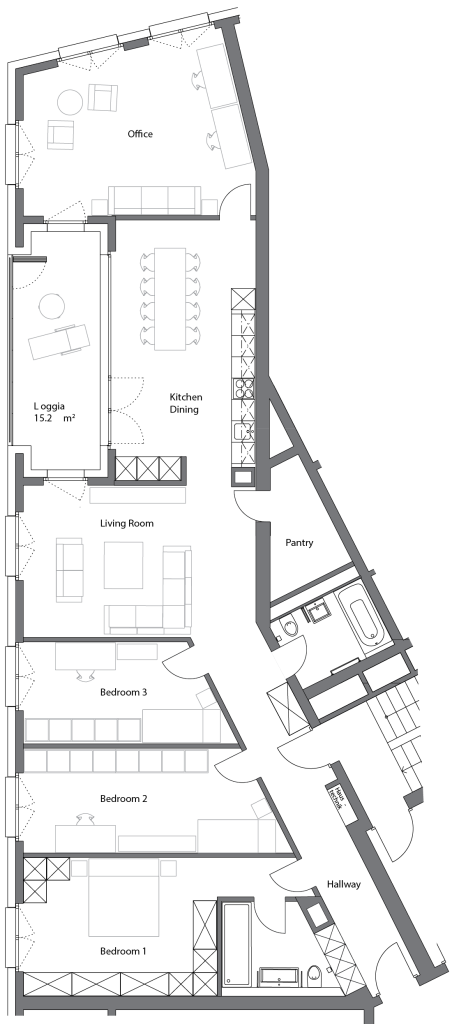
After viewing *almost* all the architecture plans of every neubau project around the Zürich area, I came to realize that sometimes architects make what I believe are some poor choices for floor layouts.

Take these two for example:

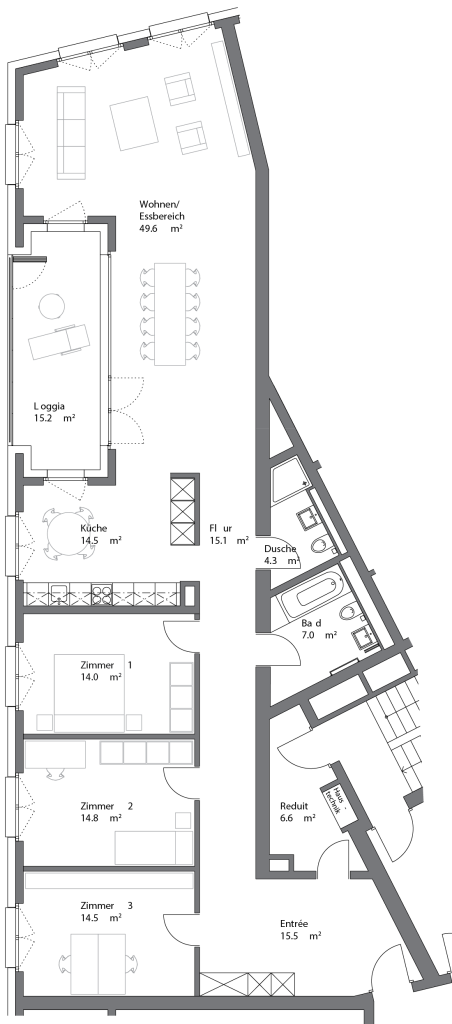
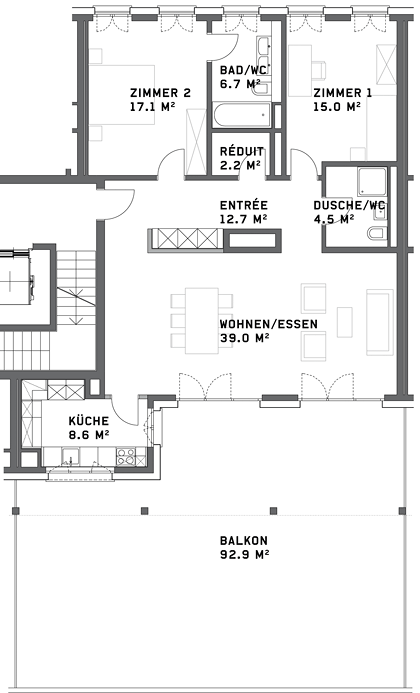
Both this and the floor plan below are for three bedroom flats around 150 sq m (1600 sq ft), cost 1-1.2 million CHF. (1.1-1.3 million USD) and NONE of them have been purchased.

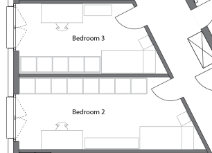
Real estate in Switzerland is usually calculated by square meters, whether or not those are useful square meters. While the flats above both have a lot of space, they occupy an unfortunate small corner of a triangular building and as a result, the layouts are not optimal.

Both flats share a massive wall that has no windows, so the space cannot really be utilized for bedrooms. And the second flat has the most unfortunate winding hallway that will do nothing but increase the price of the flat because of it’s area.

Nobody wants to pay over a million for extra hallway space.

While there’s not much I would recommend for changing the second layout, aside from having initially done the apartment below it differently so that it wouldn’t have such an awkward, long entrance hallway, I really think they could have drawn up the first plan to be more useful.

Take a look again:

The problem with the first flat, is that unlike the second one, it does not have any bedrooms bigger than 14 sq m (150 sq ft) so none of the bedrooms make an attractive master bedroom unless you sacrifice an entire room for a walk-in closet, which is pretty wasteful in Europe, although we have seen neighbors in our building do just that because the plan didn’t incorporate enough space for wardrobes in the master bedroom.

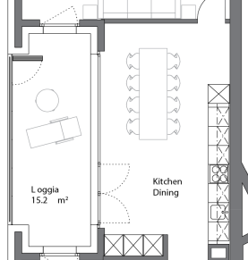
I also feel like having an open kitchen with room for a kitchen table is a bit redundant when your dining room area is right next to it. Most people would favor one table or the other and since the dining area is already informal with an open plan, I would just combine them.

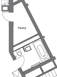
But aside from the small bedrooms, the biggest problem I have is with the massive, almost unusable entrance area and the pantry with two doors. The entrance itself is bigger than any of the bedrooms, but would not make an ideal office area because of all the doorways leading into it. Also, who wants an office area where they take their shoes and coat off?

I’m guessing that an additional stairwell in the building was required for evacuation purposes, because there is already a stairwell accessible to this flat through the main entry by the lift, but the architects still designed this pantry in the most inconvinient way possible. If one really must keep access to the door free for evacuation, one could never fully utilize the space in the pantry for storage. They would be limited to one to two shelves with access to the doors and the utility panel.

Here’s one idea that I would do instead:

First, I would have totally changed the entrance hallway to run directly along the windowless wall and to include all entries and the utility box, which is in our own hallway in our floor plan. I would also make built in closets in the hallway for coats and storage.

From there I would make a much bigger master bedroom with access to a bathroom with a huge walk-in shower with no door, double sink and toilet. There would be plenty of space for a couple’s extensive wardrobe.

Then I would make two smaller bedrooms for children, offices or guests. The rooms are large and long enough that you could fit double beds and wardrobes for children or guests, or an office with lots of shelving.

Against the Swiss standard, I would make the “public” bathroom in the flat the bathroom with a bathtub for bathing children or for guests to take baths and then I would make the space where the old small shower used to be the pantry, with an outward facing door to maximize storage room inside which could now run in an L shape along the back wall.

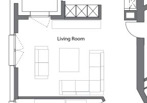
From there I’d make a spacious living room with plenty of seating options and places to put a TV setup.

Next comes the big kitchen with sit in dining. Some people are not a fan of this, but I believe this whole layout is not really conducive for a separate kitchen and these days it seems like formal dining rooms are less and less popular as people want to eat together where the food is made. A door from the living room could be optional to have the option for a closed kitchen if one wanted.

And then finally I would set a space for a big office with room for a guest bed, but this could also be used as a bedroom, guest room, playroom for children or some combination.

So I would turn those 150 sq meters into a four bedroom flat with more useable, enjoyable spaces than before.

If only Allreal had thought of this before they built the place. I’m pretty sure they are going to have to reduce the prices because the flats have been on the market for two years now without selling. And that’s pretty sad (and rare) in Switzerland, where space is limited and real estate comes at a heavy price.

Neubau Progress: Shower vs. Bathtub

Although our “rohbau” phase was completed, there was something small that I wanted to change. (I thought it wouldn’t be a big deal.)

Do you recall our floor plan? Check out the master bath. See how it has a bathtub? And the guest bath… it has a shower.

I’ve found this is something very common in Switzerland. Put the bathtub in the “Elternzimmer” aka parent’s bedroom and put the stall shower in the second and third bathrooms. But to me it doesn’t make any sense. If you have babies or little kids in the house, chances are you will probably want to give them a bath… in your master bathroom? Weird.

If you’re anything like Kay or me, chances are that you shower more often than you bathe, so why we would want to have a bathtub in our bathroom over a shower is beyond me. And yes, I know we can shower in a bathtub. I’m getting to the next point.

The reason why we were debating about bathtubs and showers was because there was an option for a “geflieste Dusche” or a flush tiled shower that Kay thought would be so much nicer than the standard shower basin. But it was very expensive at 6000+ CHF and I thought it was wasteful (and stupid) to spend almost half of our renovation budget on the guest bath that we will seldom use. If I was going to have a 6k shower, one that could even be longer than the standard 1m x 1m shower, then I wanted that shower to be in our master bathroom.

Double shower with no sliding door? Hell yeah, that sounds like a great idea. I wouldn’t even have to worry about mold growing as much with just a stationary glass wall to clean. We were both on board with that idea.

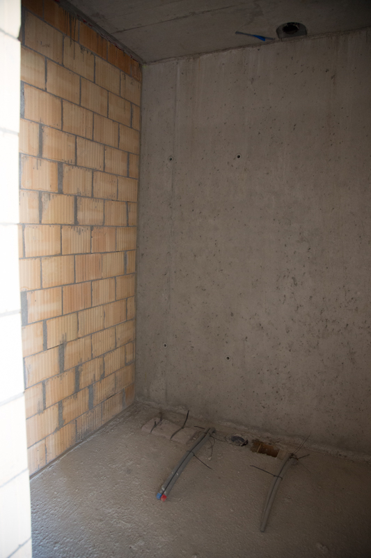
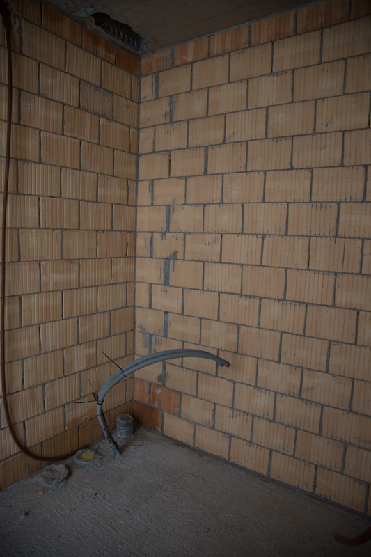
Above was what our guest bath looked like and below was what our master bath looked like. Practically the same and we assumed since everything was so far from being done that we could make a little change like this.

“Nope.”

That’s what our general contract manager (I don’t even know how to translate his title…) told us. The floors were already made, so we couldn’t swap the shower and the bathtub.

What?? It didn’t make any sense. Look above! Totally unfinished. Ok, almost totally unfinished. What’s the deal??

We were upset. We wrote registered letters telling our contract that we wanted to switch them and we wanted to know how much it cost. He refused. He told us that the floor was already made and there was a special box deeper cut for the shower installation. In order to have a tiled shower in the master bath we would have to have the floor redone and because the “rohbau” phase was done we were too late. Missed the boat. They were not going to drill up the floor for us. (They only do that themselves when they make big mistakes as we’ve seen…)

We were kind of pissed. I mean, it’s pretty handy that they were finished the rohbau phase as we signed for the apartment because we had a chance to step inside the real flat and see the layout, but switching the bathtub and the shower seemed like it should be so easy at this point and to be told they wouldn’t make this change was pretty frustrating.

In fact, it was around this time that we realized our GM is both stubborn and lazy. When he wasn’t on holiday, he wouldn’t read our emails until we’d call him after a week or two of waiting and all we ever heard from him was, “No.” Not, “Maybe we can work something else out…” Just “No“.

I also was insulted that the GM would ignore my emails and if Kay cc-ed me, the GM would only respond to Kay because “he’s the man” and obviously they are the only ones in a partnership making decisions… Even if Kay was on holiday in Cambodia and I was in Switzerland asking the guy to call me, he would still only direct his responses to Kay. Infuriating!

The GM seemed annoyed that we were taking time out of his coffee break to even address the shower issue and he refused to ever inquire about the cost of redoing a portion of the floor in the master bath, so ultimately after a couple months of fighting we had to give it up. In a complex with 170 flats, there’s no way to “have your way” in situations like this.

Neubau: 1, Katie and Kay: 0.

So when it came down to it, we took the bloody bathtub in the master bath and Kay agreed that we wouldn’t spend the money on a tiled shower, but that we would invest in some non-sliding doors for the shower stall.

Want to catch up?

Neubau Progress: I

I should have shared all these pictures a while ago, but I’ve taken my sweet time doing it. I mean, I was busy writing weddingbee recaps when I took these last March!

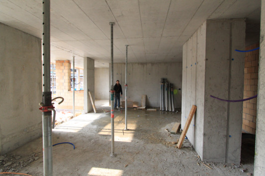
We cheated a little during our first inspection and just went to some other flats in the same row that already had the wooden beams taken down so that we could get an idea of the true height of the ceiling.

I was standing next to the kitchen entrance on the left, the hallway to the door was to the right and closer in the foreground to the right is the hallway to the bathroom/bedroom. If you notice, this particular flat doesn’t have the built in wardrobes behind that big concrete pillar on the right. The plan would look like this without the built in wardrobe:

Was that big block with all the wiring really necessary to put there in the middle instead of by one of the side walls or up inside the réduit? If that could be somewhere else, there would have been a lot more layout possibilities with the flat. I mean, yeah it’s sort of a handy donut hole for wiring (there are other holes in the kitchen and the bathrooms) but I feel like they could have planned it a little better. The thing about hallways here is that you really pay a premium for that extra floorspace, but you can’t utilize the space for tables or sofas. It’s more “walking area” than “living area”.

Taking away the built in wardrobes does open up the space a lot, but to store coats, shoes and other things you would have to buy or build some storage next to the door. We never had a coat closet in either of the flats we’ve lived in together and I’ve never had one in the flat I lived in alone, so we are both looking forward to having a place to store all our winter and summer coats. Between the two of us we really have a lot of ski jackets, trekking jackets, etc, and now they are all piled up on a poor coat stand by the door and half are shoved under the attic roof in the laundry area.

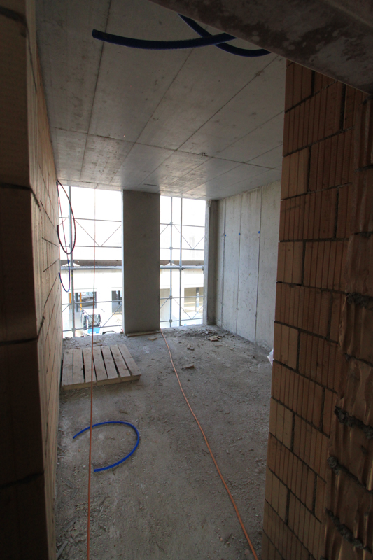
Second bedroom. Those floor to ceiling windows will be nice!

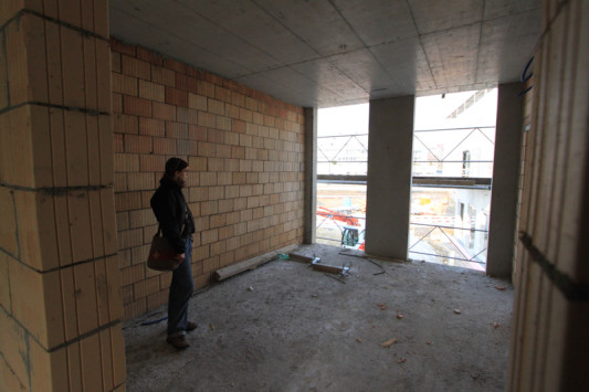
Looking out our bedroom windows.

Standing in the master bath where the tub will eventually be. I’m obviously really excited about showering here someday. Kay thought the master bath is small, but I think it looks huge, don’t you?

Another view from the living room into the kitchen.

When we viewed the flat without the wooden beams up, Kay still thought it looked overall small, but I was happy with the size. I seem to have better spacial skills (whereas he wins with directional skills) and I was happy with how large it is. The bedrooms are not enormous, but the living room is huge for us and the kitchen will be a big upgrade.

Theoretically we could  have a baby here if forced to and it should be large enough that we can set up some kind of guest room. This makes it OK in my book!

Want to catch up?