Tag Archives: Apartment

…and we finally finish painting

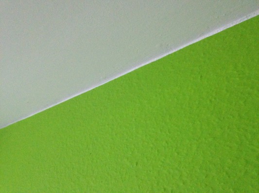
I realized I sort of left you hanging about our paint job. The truth is, I’m actually still not 100% super duper totally satisfied with my edges, but we did receive white paint from the workers and I went up to the kitchen ceiling immediately and began fixing the tape goofs.

Wow, look how much better that edge looks now! It was easy to get the green looking nice, but I had the darnedest time with the purple, especially around the frame of the entry door because the workers botched that up already and had painted white all over the side of the frame, so it was hard to tell what was what and get a good line.

I’m kind of “done” with touchups for awhile though. I spent a couple weeks touching up the walls here and there, including filling in some more paint where the second coat still had not got it completely colored.

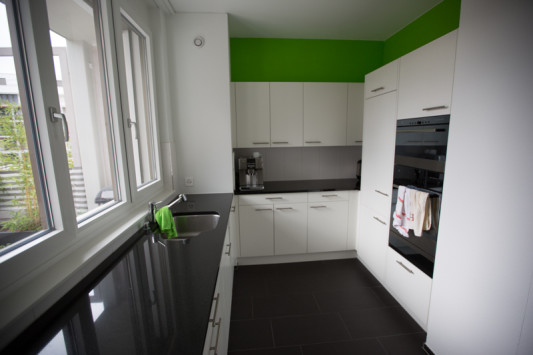
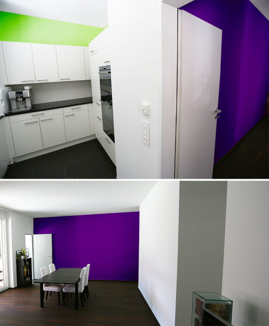
These are the results!

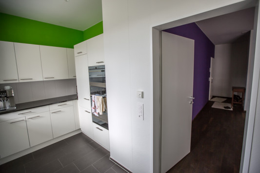
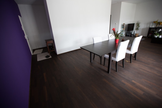
The green in the kitchen really is just a little  bit, but I love how it makes the room pop and look much more fresh and lively than when it was all white. And from the entry to the kitchen you can see both colors and how it compares to our paint inspiration.

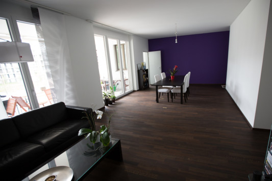
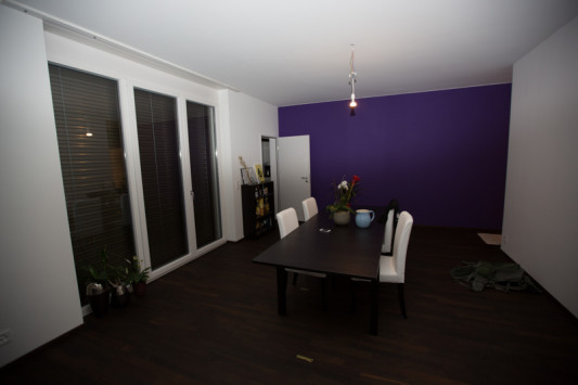
Kay and I both really like the purple. It is not too dark, but it is nice and rich and it makes a big statement when you are in the room. It almost makes me want to paint another wall, if it weren’t so annoying to buy a good brush in this country!

The living room still looks lost and empty without much furniture… and we really need to go ahead and get the lamp for the dining table that we have our eyes on… it’s just that we want (OK, I want…) a second couch and it’s hard to know where the table should go permanently before we’ve got the second couch there.

What a sad little lonely light it is right now… and curtain-less windows. Sigh. But we bought fabric in the US in September and I’ve got some projects planned and underway for those windows!

Moral of the story? Don’t tape unless it’s really helpful, because 99% of the time it is unhelpful and takes forever. Waste of both time and money and more time!

Paint Inspiration

Painting our walls was always off-limits while we lived in rentals because Kay is… how can I say it, super Swiss, so he was always terrified of doing anything to endanger our deposit. Considering that our deposit was around 5500CHF ($6000), it was a big deal and I didn’t push the issue because I also wanted to get all that money back some day. This meant no nail holes and no paint.

When we lived in Winterthur and Kay was furnishing what started out as his own flat, he bought black furniture to go in the all-white flat and red curtains for a very Swiss red/black/white decor. That flat was the extreme of the “clean Swiss look”. It had stark white tile, white walls and white cabinets. He didn’t hang any pictures up during his entire time there.

When we moved to Zürich together, we had the lovely terracotta flooring and wooden beams throughout the ceiling, so the flat had enough color that I didn’t feel like I was being suffocated in white and he even nailed one hole in the wall for a painting from Paris. But now that we have moved again to a place with a little less character than our charming attic flat, I’m really looking forward to finally being “allowed” to paint some color onto the walls!

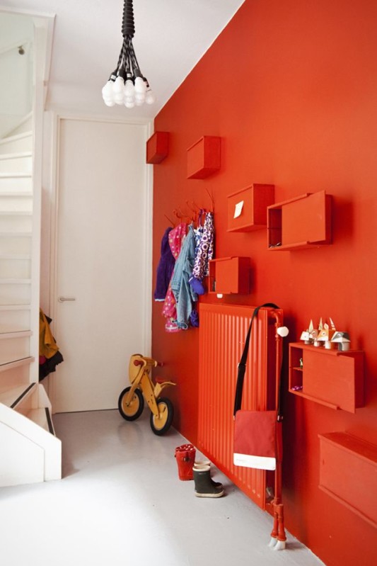
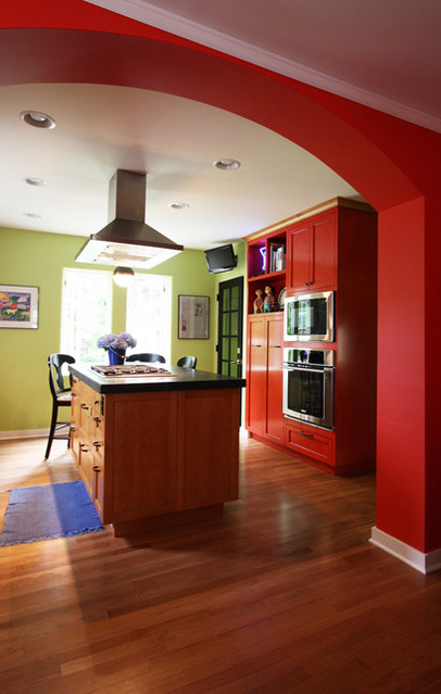
For what seems like forever, I’ve been dreaming of a bright red wall like I found on Pinterest:

(Via  plentyofcolour.com.)

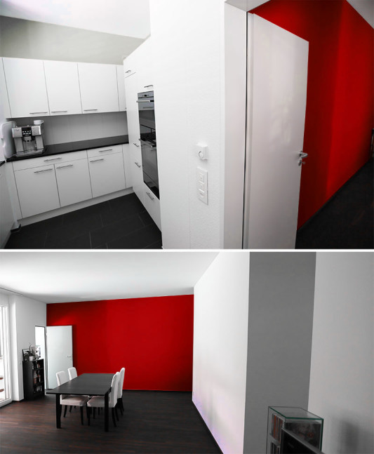
See how nice it would look in reality below? And you can buy so many red home decor items in Switzerland. Decorating = done.

But over the year Kay went to visit a friend who did some lime green in the kitchen and ever since then he’s been dreaming of bright lime green in the kitchen, which in my mind just wouldn’t go with the red in the living room… but then I found this inspiration picture and I’m just not sure. What do you think? Too Christmassy?

(Via Houzz)

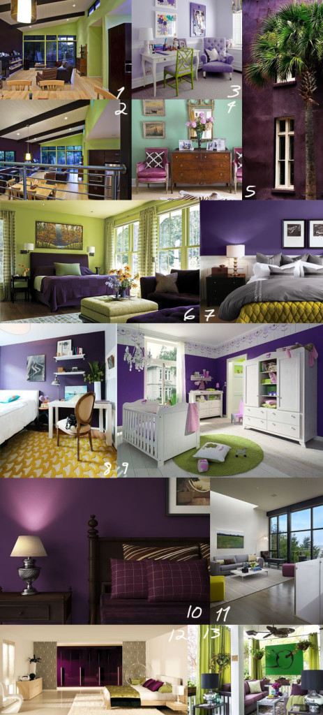
Kay seemed pretty set on this lime green idea. “So fresh!” he would say, so I started thinking of colors that would go better with lime green than red and remembered how much I like purple and green mixes. At first Kay thought this sounded super crazy… so I needed to compile a bunch of inspiration pictures before he warmed up to the idea of painting anything purple in our house.

(1/2: Via Houzz  3. Via Houzz 4.Via Houzz  5. Via 6. Via New England Home  7.Via Room Decorating Ideas 8. Via Apartment Therapy 9. Via Mummy’s Little Dreams 10. Via Deviantart 11. Via Houzz 12. Via Hammonds 13. Via Houzz)

Kay still wanted to see it on our walls via Photoshop, so I mocked up the red version earlier and this version below to give him an idea.

We both really liked the way the green and purple accent walls will interact with each other from the kitchen and there will still be plenty of Swiss white walls, so no big paint job (saves costs!) and we will still be able to use Kay’s mood lighting from Philips to play around with color in the living room.

Who comes up with the color choices in your household?

Thinking like an architect

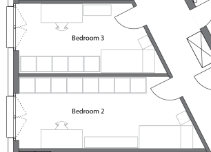
After viewing *almost* all the architecture plans of every neubau project around the Zürich area, I came to realize that sometimes architects make what I believe are some poor choices for floor layouts.

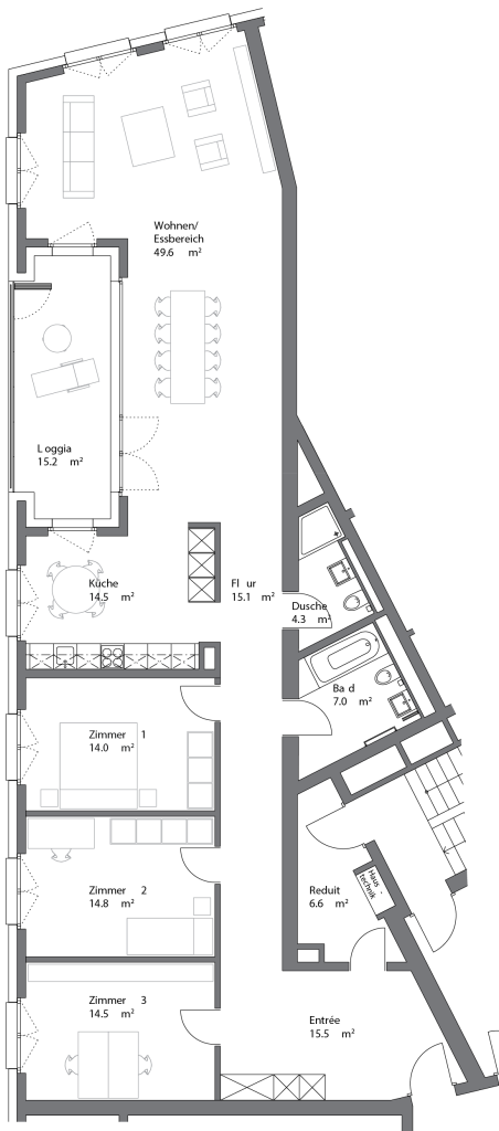
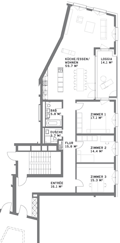
Take these two for example:

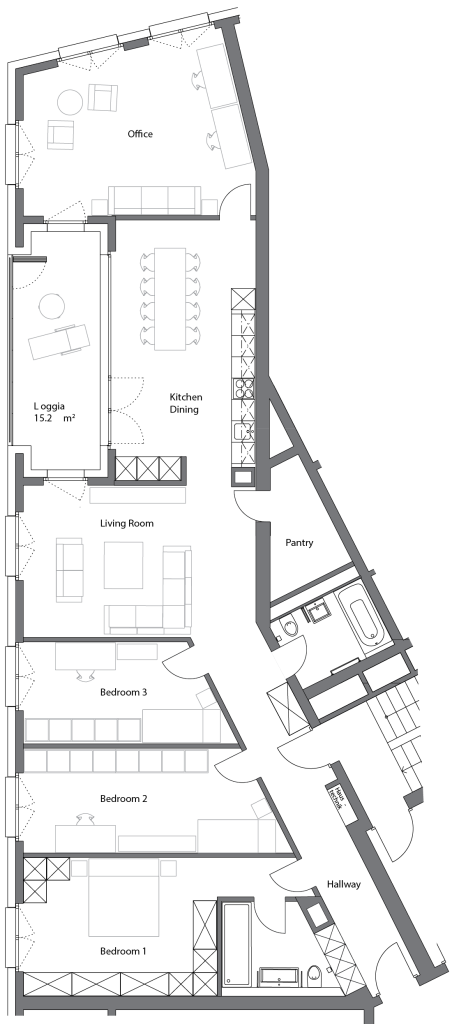
Both this and the floor plan below are for three bedroom flats around 150 sq m (1600 sq ft), cost 1-1.2 million CHF. (1.1-1.3 million USD) and NONE of them have been purchased.

Real estate in Switzerland is usually calculated by square meters, whether or not those are useful square meters. While the flats above both have a lot of space, they occupy an unfortunate small corner of a triangular building and as a result, the layouts are not optimal.

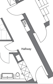
Both flats share a massive wall that has no windows, so the space cannot really be utilized for bedrooms. And the second flat has the most unfortunate winding hallway that will do nothing but increase the price of the flat because of it’s area.

Nobody wants to pay over a million for extra hallway space.

While there’s not much I would recommend for changing the second layout, aside from having initially done the apartment below it differently so that it wouldn’t have such an awkward, long entrance hallway, I really think they could have drawn up the first plan to be more useful.

Take a look again:

The problem with the first flat, is that unlike the second one, it does not have any bedrooms bigger than 14 sq m (150 sq ft) so none of the bedrooms make an attractive master bedroom unless you sacrifice an entire room for a walk-in closet, which is pretty wasteful in Europe, although we have seen neighbors in our building do just that because the plan didn’t incorporate enough space for wardrobes in the master bedroom.

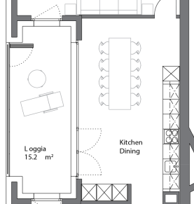
I also feel like having an open kitchen with room for a kitchen table is a bit redundant when your dining room area is right next to it. Most people would favor one table or the other and since the dining area is already informal with an open plan, I would just combine them.

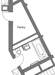
But aside from the small bedrooms, the biggest problem I have is with the massive, almost unusable entrance area and the pantry with two doors. The entrance itself is bigger than any of the bedrooms, but would not make an ideal office area because of all the doorways leading into it. Also, who wants an office area where they take their shoes and coat off?

I’m guessing that an additional stairwell in the building was required for evacuation purposes, because there is already a stairwell accessible to this flat through the main entry by the lift, but the architects still designed this pantry in the most inconvinient way possible. If one really must keep access to the door free for evacuation, one could never fully utilize the space in the pantry for storage. They would be limited to one to two shelves with access to the doors and the utility panel.

Here’s one idea that I would do instead:

First, I would have totally changed the entrance hallway to run directly along the windowless wall and to include all entries and the utility box, which is in our own hallway in our floor plan. I would also make built in closets in the hallway for coats and storage.

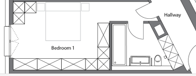
From there I would make a much bigger master bedroom with access to a bathroom with a huge walk-in shower with no door, double sink and toilet. There would be plenty of space for a couple’s extensive wardrobe.

Then I would make two smaller bedrooms for children, offices or guests. The rooms are large and long enough that you could fit double beds and wardrobes for children or guests, or an office with lots of shelving.

Against the Swiss standard, I would make the “public” bathroom in the flat the bathroom with a bathtub for bathing children or for guests to take baths and then I would make the space where the old small shower used to be the pantry, with an outward facing door to maximize storage room inside which could now run in an L shape along the back wall.

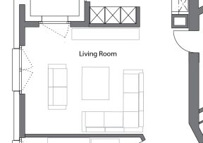
From there I’d make a spacious living room with plenty of seating options and places to put a TV setup.

Next comes the big kitchen with sit in dining. Some people are not a fan of this, but I believe this whole layout is not really conducive for a separate kitchen and these days it seems like formal dining rooms are less and less popular as people want to eat together where the food is made. A door from the living room could be optional to have the option for a closed kitchen if one wanted.

And then finally I would set a space for a big office with room for a guest bed, but this could also be used as a bedroom, guest room, playroom for children or some combination.

So I would turn those 150 sq meters into a four bedroom flat with more useable, enjoyable spaces than before.

If only Allreal had thought of this before they built the place. I’m pretty sure they are going to have to reduce the prices because the flats have been on the market for two years now without selling. And that’s pretty sad (and rare) in Switzerland, where space is limited and real estate comes at a heavy price.

…and then THIS happens.

One week after living in our flat, I came home to this in our guest bathroom:
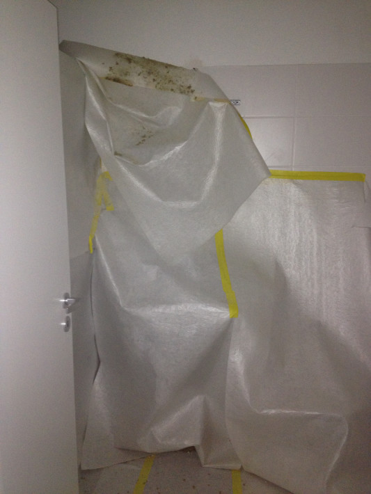
Maybe I need to preface a bit… a few days after we moved in, the workers finishing the business space below our flat knocked on our door and said they were searching for the source of a water leak. We let our tap in our guest bathroom run for ten minutes and they verified that their was a problem with the pipes behind our walls.

Somehow, they had failed to notice this plumbing error in the year and a half that we were waiting for them to finish our flat. I’m sure if the water had actually been turned on for our pre-acceptance visit they might have noticed this problem before we moved in. Great planning guys.
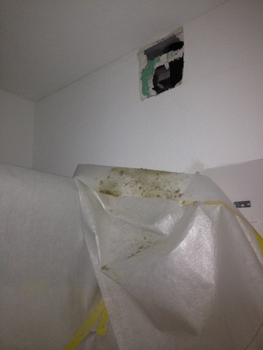
Instead, with most of our boxes still packed up and scattered around the house, we had to give our key over to some people working for Allreal that we don’t really know or have a personal contract with. (Accountability??) Then we had who knows how many workers coming in and out of our house to repair the pipes, fix the wall and re-tile.

Our bathroom cabinet and mirror were dismantled and all hope of unpacking and organizing the guest bathroom and hallway closets was lost.
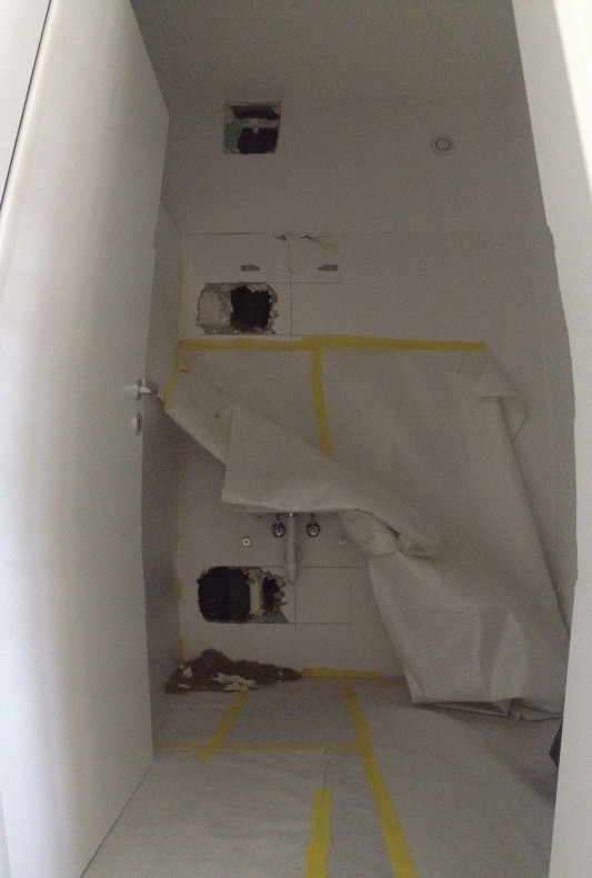
To say that I was less than impressed with Allreal would be an understatement. After all our problems with them messing up the grout and taking the lazy/shitty method of fixing their mistake, they had to rip tiles out anyway to fix their plumbing error. I was furious!
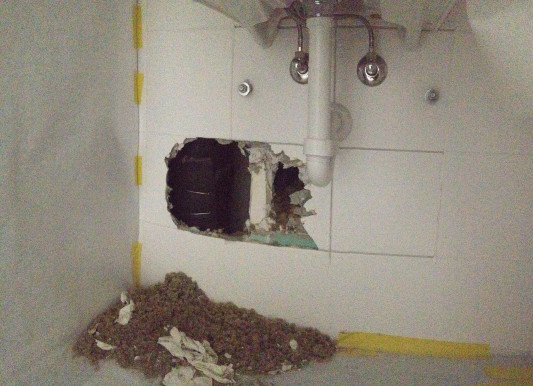
Whereas we used to enjoy a separate toilet and shower room in Zürich, suddenly we were reduced to one bathroom in the morning. It made showering and sharing more difficult for an already tired, sore and grumpy Katie.
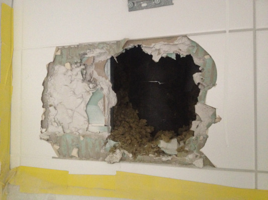
Allreal fixed the pipes relatively quickly, but they had to keep coming each day to re-do the wall, re-tile and grout everything. In the mean time we locked our office every day for security reasons, and I stupidly almost lost the office key and spent an infuriating 30 minutes searching for it when I got home one night, wanting to organize and unpack the locked office.
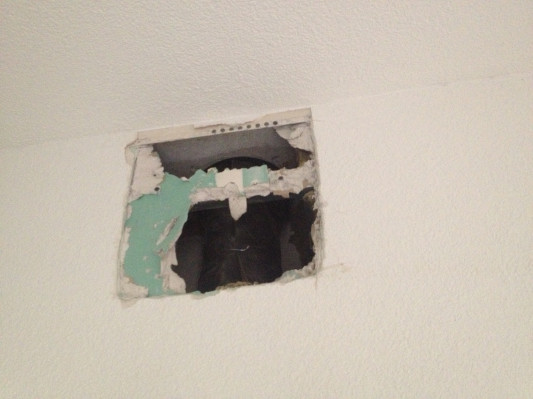
Busting open the wall also coated our entire flat in a thin layer of dust that you can see when I rolled up the floor protection for the weekend. I realized that in addition to everything being covered in dust, whenever we walked on the floor cover, we would just track all the crap on top of it all over the rest of the house and after awhile we were both walking around with grimy feet.
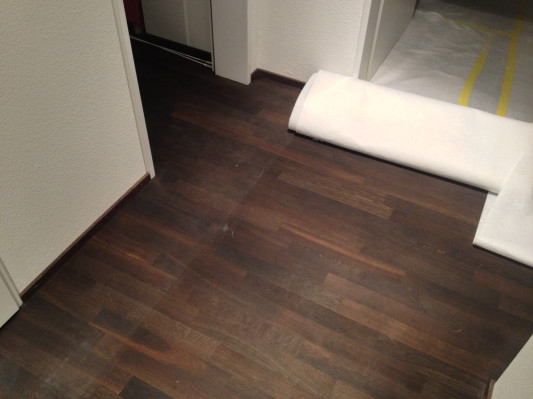
This coat of dust made it all the way around the house through closed doors as well. I still have to wipe down all the kitchen cabinets, all the tiles and surfaces in the bathrooms, wash the floors and at some point wash the surfaces in the living room, bedroom and office.

That doesn’t make moving any easier folks.
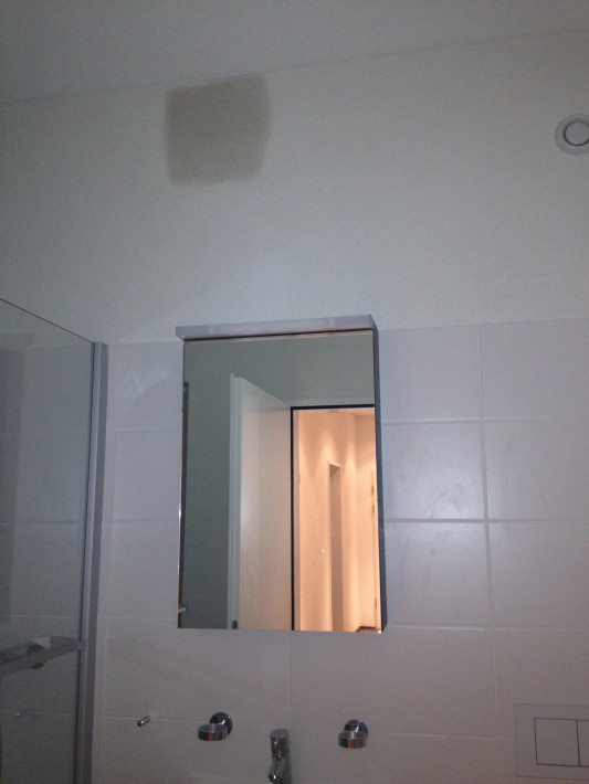
By the weekend they had patched the wall up, but they still had to paint it and grout around the sink cabinet.
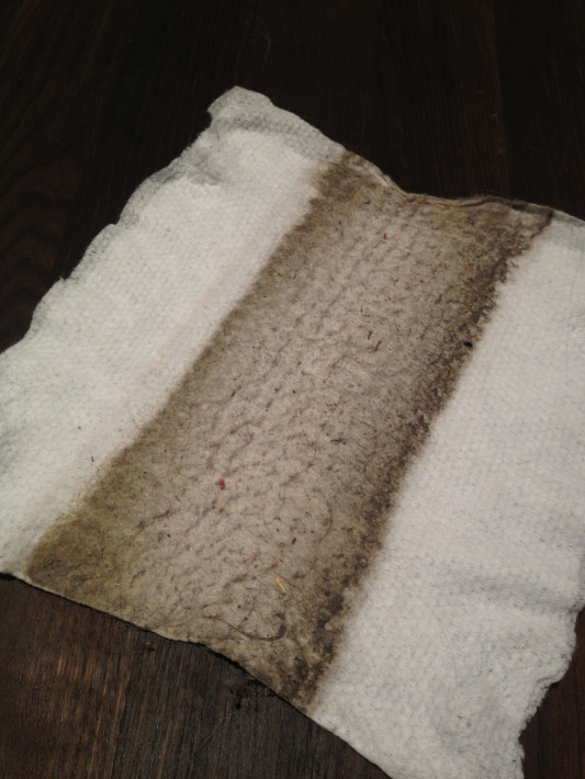
In the mean time, I was swiffering to at least make the place walkable over the weekend. Just a little work and look what was all over my Swiffer!
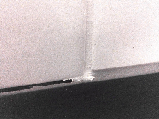
After a week and a half or so of repairs, we arrived home and the floor protection was gone. But our key was not returned… It appeared as though they were done, but I noticed they forgot to grout between the floor molding and the wall tiles, so we have a nice gap in the wall where water could run between the wall. Again, I was not impressed.
And throughout the whole week… the toilet paper roll in the guest bathroom started dwindling until it was gone. Now, since neither Kay nor I were using the toilet during the repairs, I am kind of thinking we had some random men shitting in our home while we were at work. Just a hunch… I’ll never know, but we also found a very random, disgusting spot of blood (?) on the toilet rim when their work was done. If that doesn’t gross you out… well, what would?

Maybe it sounds harsh that I wouldn’t want workers using our toilet, but there has been an open public toilet with two stalls available halfway down the stairs in our building plus lots of port-o-potties outside. And I’d be fine with them taking a leak in there, but the fact that they used up an entire roll of toilet paper just ticks me off.

Other than that, I was finally free to organize this bathroom finally (and CLEAN it!!) Which reminds me I wanted to tell you about how Allreal did a crappy job re-grouting our tiles. See the soap dispenser and the towel grip and everything below? Guess who was too lazy to remove the bathroom fixtures and cabinets before re-grouting?

Just guess!
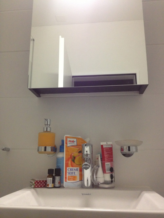
Of course I didn’t notice during our inspection, but afterward I was inspecting our towel hooks because the ones we wanted were discontinued and I’m not totally happy with the ones we ended up with. I thought it was strange why there was white grout all around the edges of the fixture, so I unscrewed it to discover this:
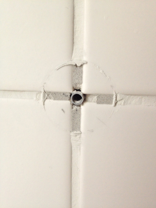
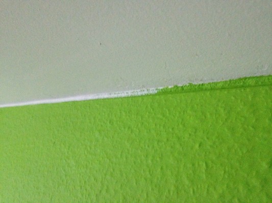
Jep. Those jerks drilled out all the grout in the bathroom, but DIDN’T EVEN REMOVE THE FIXTURES. WTF. This is as bad as leaving the light switch covers on and painting around them, which they actually ALSO DID. Lazy fucks! We have to cut all the outlet covers off any time Kay wants to change something to our outlets because there is paint all over them, gluing them to the walls.

The grout looked especially stupid when they removed the bathroom cabinets for the repair and you could see where they squished the white grout in and where the old grey grout was still there. Unbelievably lazy.

The “quality” of Allreal:
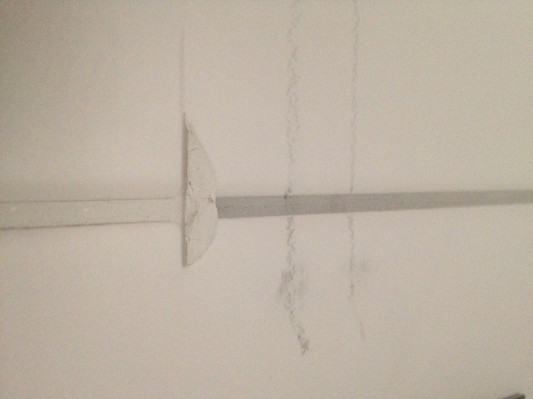
That’s supposed to be a straight line of white grout. If that’s their definition of quality, well… it’s certainly not “Swiss quality.”

Below the sink I encountered more of their genius. During inspection I thought it was clever that they put that hole in the shelf so that I can raise the shelf higher around the pipes, until I actually went to do so.
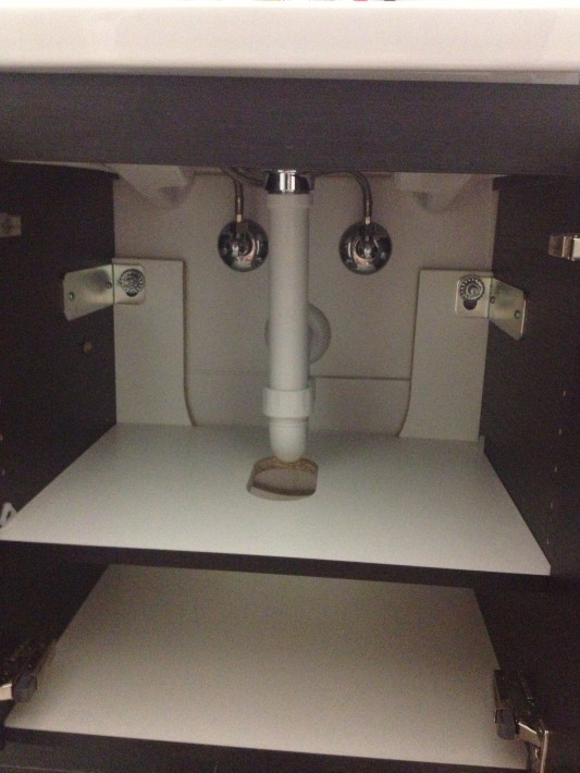
Look who drilled the shelf hole slightly too far forward so that it does not function at all. Comical.
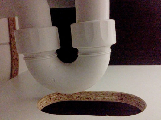
Kay said he can maybe cut further back so that we can get the shelf around the hole, but one has to wonder why they even bothered drilling a hole there at all if they weren’t going to measure it. Really.

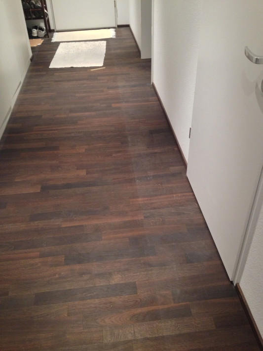
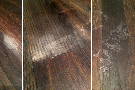
And after they took the protection sheet off the floor, they managed to get grout or paint or something on the floor leading to the door. We complained about it and when they finally returned our key (while simultaneously tracking dusty footprints all over the living room and into the kitchen) they had smudged or sanded the floor a bit, but the marks are all still clearly visible below. For a brand new home, it’s disappointing.
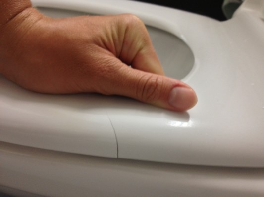
The final straw was when I was sitting on my throne in our master bath and I realized there is a crack in the toilet seat that is only really visible when pressure is put on the seat. Maybe they came and shat in this bathroom too? I wouldn’t put it past them.
I give up! I thought owning a brand new home was supposed to come with less problems.

Let this post be a testament to Allreal’s craftsmanship (or lack thereof). There has been a lot of talk about quality going downhill when people here hire foreign labor with cheaper overhead and I’m pretty sure all our flat’s problems are a direct result of untrained workers and lack of supervision.

We will also have to live with most of the mistakes as they are “within the tolerance” as Allreal so eloquently puts it. They don’t care that I can still see traces of grey grout in ALL the tiles in the bathrooms on both the white and the dark grout and I’m sure they don’t care that we have paint all over our outlet covers.

Just take caution in case you ever think of hiring this company to build for you. And then don’t hire them.

Homeowners!

It’s been a crazy couple weeks as the internet was cut, we moved and waiting to get back online at the new place. Oh how I missed internet! Sweet, sweet internet.

On the Friday of our move we got up at 6:45am to get to the notary office by 8am sharp. Our appointment (all in Swiss German, yikes!) didn’t last long. We were given some papers to read over and sign and then the deed was officially, legally passed over.

After we were done at the notary we popped into the Gemeindehaus to register because we had de-registered in Zürich the day before. (You must register where you live with the authorities at all times, no gaps!) Kay paid 20CHF for us to re-register and 45CHF went to the Bundesamt für Migration (immigration) simply because I am a foreigner. 😉

I asked if I could complete my new Ausländerausweis at the same time because we married in the summer so every July/August I have to do it. But I forgot that I have to get the stupid form signed by my employer, despite the fact that my permit is supplied directly through my Swiss spouse. Argh. That means another trip to the Gemeindehaus for me! (I joked to Kay that I should be a house wife so my forms are easier to fill out!) When I returned to the Gemeindehaus with my signed permit form, I paid an additional 102CHF for my annual foreign residence permit, putting my fees 147CHF over a normal person like Kay’s. Le sigh.

Back at the flat we completed our inspection and things looked… surprisingly OK. The grout job in the bathroom was still not as good as if they had done it correctly the first time, but to be honest, I’m pretty anal about the small details. But I’ll get into that later… with our keys in hand, we were finally home owners!!

Up next, the move!