Ever since I came across John and Sherry’s gianormous sectional on YHL, I dreamt of filling our new living room with something similar. Like, almost exaaactly the same, with colourful pillows included.
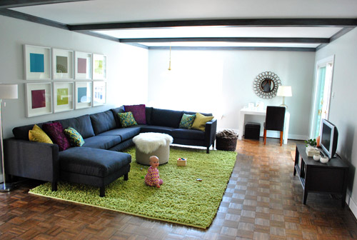 (Picture via YHL)
I obsessed a bit about what sofa John and Sherry had bought. The shape and legs looked strangely similar to the leather one Kay bought in 2008 when I moved to Switzerland.
There was a big “duh” moment when I peeked under our sofa and read the tag to confirm that Kay’s sofa is actually also a Karlstad sofa!
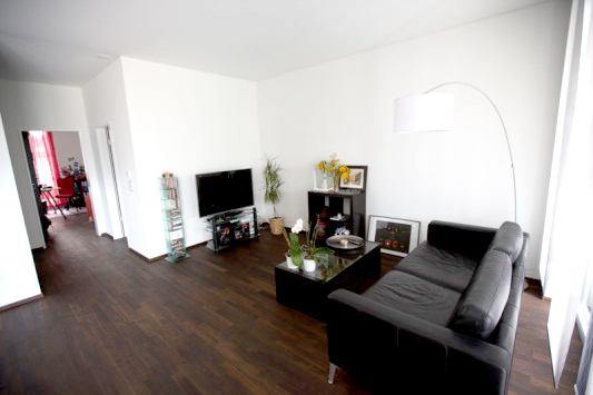
I knew that Kay’s sofa originally cost around 1500CHF, so I wasn’t really interested in finding out how much the huge sectional version would cost, but Kay liked the idea of continuing with the leather because it lasts a long time and it is easy to take care of.
Unfortunately, IKEA discontinued the Karlstad leather version and changed over to a slightly smaller sofa with tufts, which Kay heartily dislikes “because they are old-fashioned”. Dun dun dun. Never heard him call anything old-fashioned before…

Karlsfors sofa for 1999CHF from IKEA.
I even scoured the interwebs for used corner sofas in leather from Karlstad. I came really close to finding one in Germany, but it was dark brown, which is a huge no-go for Kay and it wouldn’t match anyway. Oh well.
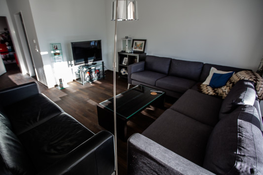
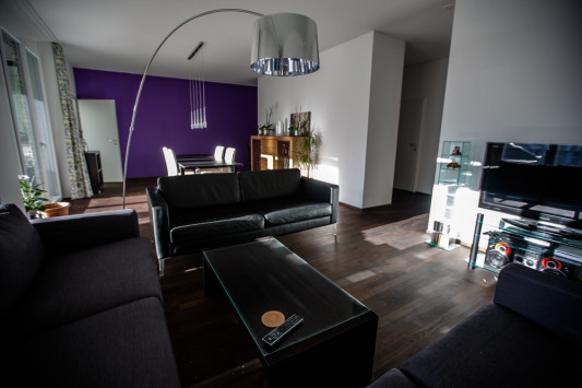
But as you can see, our TV area in the living room still looks empty and lonely. And I still wanted a corner sofa, badly.
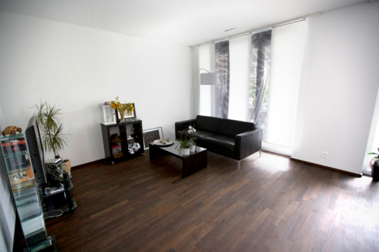
I debated internally for a long time if it was worth it to keep Kay’s couch or incorporate it into a sectional layout. I loved the idea of the chaises in the sectional from YHL, so I dreamt up buying an all-in-one like this and situating it somewhere where we could still use both of the balcony doors.
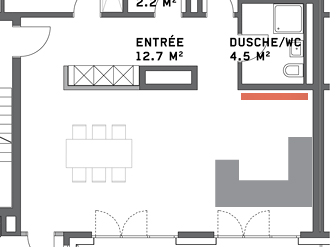
But the more I thought about it, the more I thought it was not a good idea to just get rid of a perfectly good sofa. And no matter how I worked it, it didn’t make sense to stick this beast in with our current sofa. It became too much.
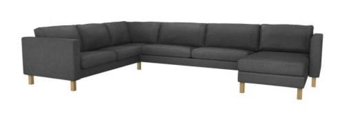 I had fun playing with literally ALL the combinations of Karlstad sofas available and seeing what would work best for us. And as we used the living room the whole summer, Kay pointed out that we rarely went out the balcony doors by the sofa. Especially since now that he’s pushed the sofa all the way back to the balcony door, making them inaccessible.
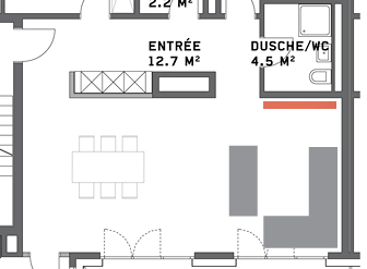
Kay thought if it makes sense, we should just put a corner sofa wherever we please and use the door to the balcony by the dining table. I’m still annoyed that they open inwards because it wasn’t an option to change, but Kay is right… we are most often taking food in and out of the kitchen and it’s not necessary to have two doors to the balcony.
With all that in mind, I decided that the best fit for maximum seating would be a corner sofa without any chaises or add-ons. Now we just needed to figure out which color!
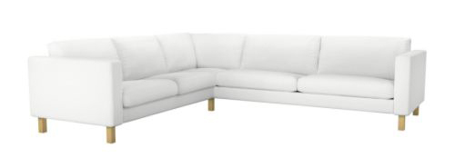
At 999CHF, white is actually the cheapest option. And if we are ever going to do white sofas, shouldn’t it be now, while we don’t have children? Kay was up for it even with the possibility of extra washing, but after looking at our space, I just didn’t feel like white fit in with our dark brown floors and purple wall. It would be a better match for the light oak in some homes here.
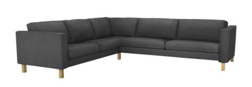
Of course, I still loved the idea of the dark grey, but I wanted to explore other options too.
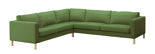
The green was in our color scheme, but not bright enough to match our walls and it just seemed a little too cooky for our style. I don’t want any problems selling this sofa in a few years!
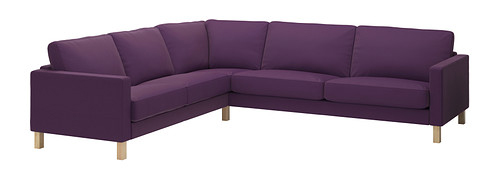
And purple. I’m not sure I could convince Kay about the new Sivik purple. I got the color on the walls, but an entire sofa is another deal. It’s also not the same hue as our walls and it’s a little more expensive. Hmm.
There was one thing clear. We would be buying the metal legs to match the leather sofa. Even if the sofas are different material and color, the shape is the same and the legs will match!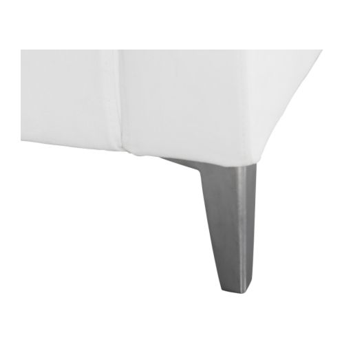 What color do you think we chose? Anybody else a big Karl fan?
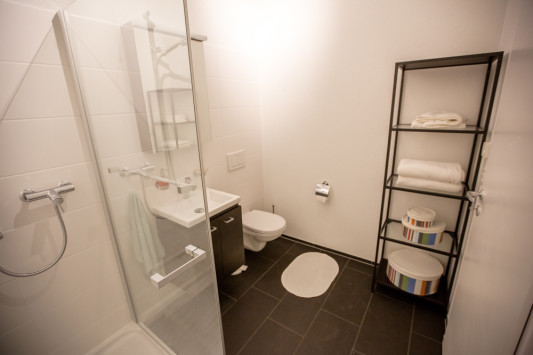 This was right when we bought the shelf. Since we haven’t gotten our wardrobes built yet, I later stored all our extra sheets in here as well as all of the towels from the pantry. I cleared out enough room in the pantry that I can put my sewing machines in there instead of under my desk in the office.
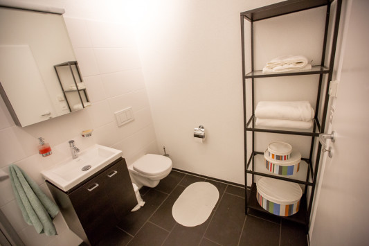 This room still looks reaaaallly empty to me. Even worse on photos. Especially this corner below which is your view from the throne. I kind of don’t want to paint in this room, but I want to put some color in here because it’s screaming for it.
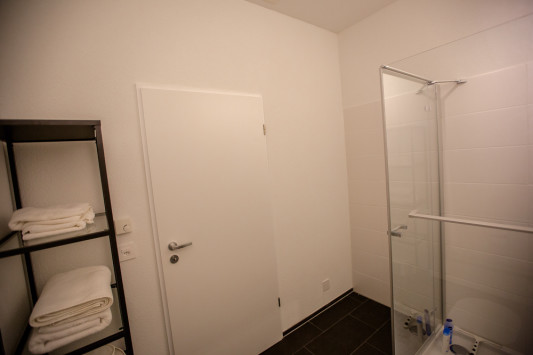 I would like to put a big, cushy square rug in front of the shower door over there to walk out onto and maybe a nice big picture on that wall. I actually am planning on putting up art or photos at some point.
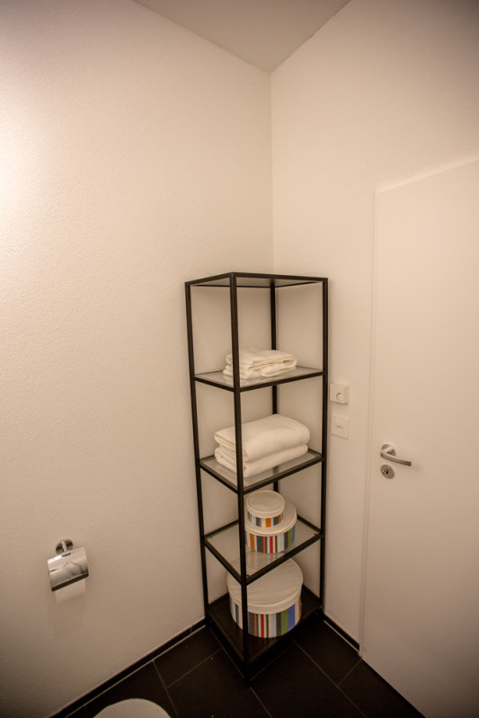 I tried to convince Kay to go for the taller white FJÄLKINGE shelf offered at IKEA for 119CHF, but he thought it looked like crappy quality and he assured me that he will be responsible for cleaning the glass shelves of the shelf we bought. Hah.
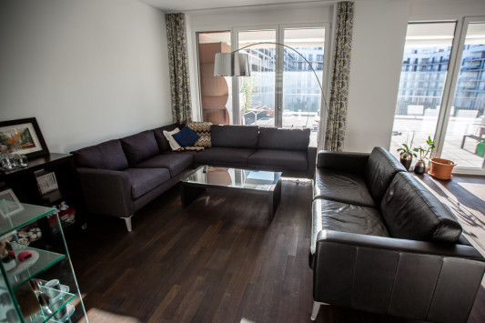
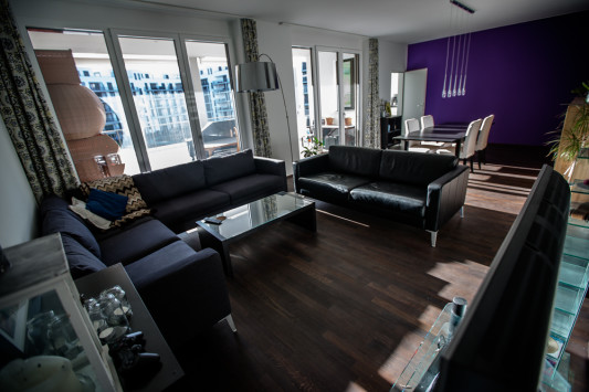
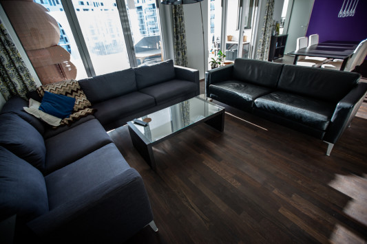
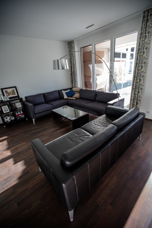
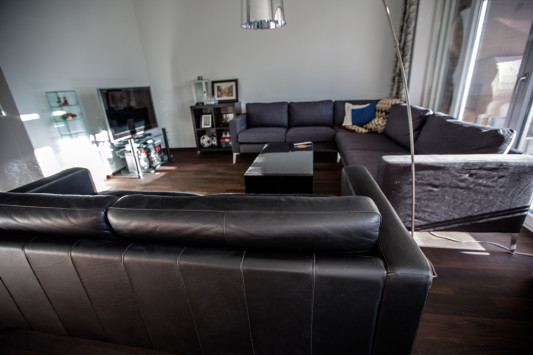
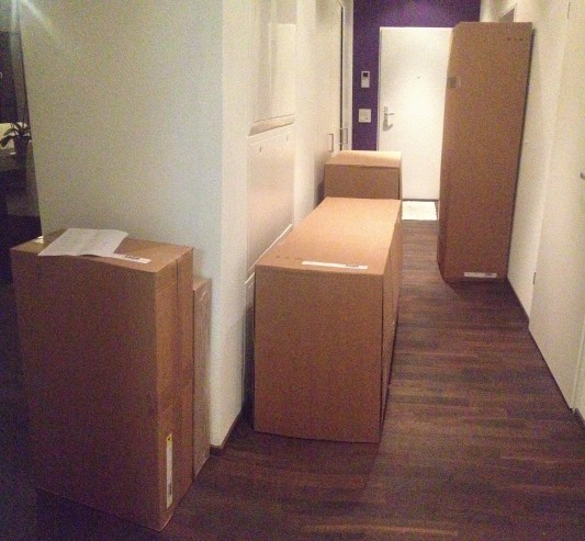


 What color do you think we chose? Anybody else a big Karl fan?