After viewing *almost* all the architecture plans of every neubau project around the Zürich area, I came to realize that sometimes architects make what I believe are some poor choices for floor layouts.
Take these two for example:
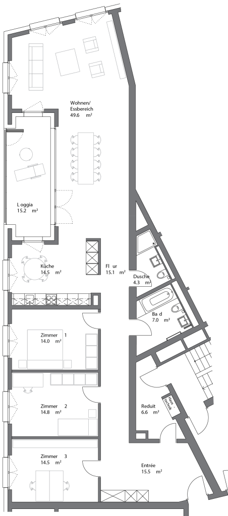
Both this and the floor plan below are for three bedroom flats around 150 sq m (1600 sq ft), cost 1-1.2 million CHF. (1.1-1.3 million USD) and NONE of them have been purchased.
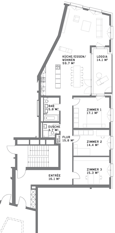
Real estate in Switzerland is usually calculated by square meters, whether or not those are useful square meters. While the flats above both have a lot of space, they occupy an unfortunate small corner of a triangular building and as a result, the layouts are not optimal.
Both flats share a massive wall that has no windows, so the space cannot really be utilized for bedrooms. And the second flat has the most unfortunate winding hallway that will do nothing but increase the price of the flat because of it’s area.
Nobody wants to pay over a million for extra hallway space.
While there’s not much I would recommend for changing the second layout, aside from having initially done the apartment below it differently so that it wouldn’t have such an awkward, long entrance hallway, I really think they could have drawn up the first plan to be more useful.
Take a look again:

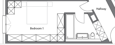
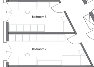
The problem with the first flat, is that unlike the second one, it does not have any bedrooms bigger than 14 sq m (150 sq ft) so none of the bedrooms make an attractive master bedroom unless you sacrifice an entire room for a walk-in closet, which is pretty wasteful in Europe, although we have seen neighbors in our building do just that because the plan didn’t incorporate enough space for wardrobes in the master bedroom.
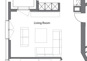
I also feel like having an open kitchen with room for a kitchen table is a bit redundant when your dining room area is right next to it. Most people would favor one table or the other and since the dining area is already informal with an open plan, I would just combine them.
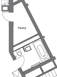
But aside from the small bedrooms, the biggest problem I have is with the massive, almost unusable entrance area and the pantry with two doors. The entrance itself is bigger than any of the bedrooms, but would not make an ideal office area because of all the doorways leading into it. Also, who wants an office area where they take their shoes and coat off?
I’m guessing that an additional stairwell in the building was required for evacuation purposes, because there is already a stairwell accessible to this flat through the main entry by the lift, but the architects still designed this pantry in the most inconvinient way possible. If one really must keep access to the door free for evacuation, one could never fully utilize the space in the pantry for storage. They would be limited to one to two shelves with access to the doors and the utility panel.
Here’s one idea that I would do instead:
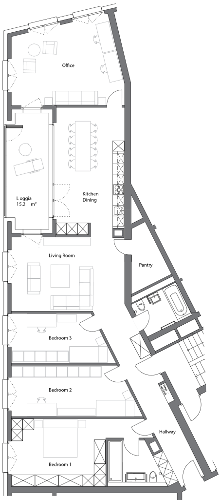
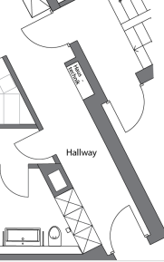
First, I would have totally changed the entrance hallway to run directly along the windowless wall and to include all entries and the utility box, which is in our own hallway in our floor plan. I would also make built in closets in the hallway for coats and storage.
From there I would make a much bigger master bedroom with access to a bathroom with a huge walk-in shower with no door, double sink and toilet. There would be plenty of space for a couple’s extensive wardrobe.
Then I would make two smaller bedrooms for children, offices or guests. The rooms are large and long enough that you could fit double beds and wardrobes for children or guests, or an office with lots of shelving.
Against the Swiss standard, I would make the “public” bathroom in the flat the bathroom with a bathtub for bathing children or for guests to take baths and then I would make the space where the old small shower used to be the pantry, with an outward facing door to maximize storage room inside which could now run in an L shape along the back wall.
From there I’d make a spacious living room with plenty of seating options and places to put a TV setup.
Next comes the big kitchen with sit in dining. Some people are not a fan of this, but I believe this whole layout is not really conducive for a separate kitchen and these days it seems like formal dining rooms are less and less popular as people want to eat together where the food is made. A door from the living room could be optional to have the option for a closed kitchen if one wanted.
And then finally I would set a space for a big office with room for a guest bed, but this could also be used as a bedroom, guest room, playroom for children or some combination.
So I would turn those 150 sq meters into a four bedroom flat with more useable, enjoyable spaces than before.
If only Allreal had thought of this before they built the place. I’m pretty sure they are going to have to reduce the prices because the flats have been on the market for two years now without selling. And that’s pretty sad (and rare) in Switzerland, where space is limited and real estate comes at a heavy price.

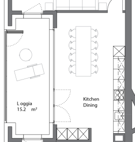
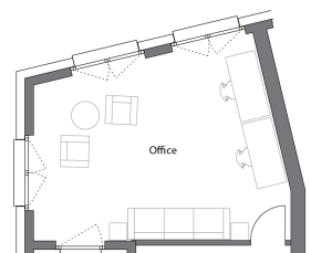
Wow, those are some terribly laid out apartments! Maybe it’s different in Switzerland, but to me the obvious fix would have been to put the living space closer to the entry way (since there are windows there) and then start the bedrooms, and put the rest of the bedrooms in the back along the wall with the windows. You don’t want guests to have to travel down a long hall past all the bedrooms just to get to the living room!
I agree, I like spaces that open directly to a living space with the bedrooms off of that and no hallway at all. And since doors and walls are so well insulated here, I think hallways just take up precious space!
But to change that in this plan, they probably would have also had to move the loggia/balcony closer to the entry so it’s accessible from the living space. Ah well! They are putting the finishing touches on it now.
I like your blueprint! I like the open layout and the big pantry. Reducing the entry space to add the ensuite in the master bedroom makes more sense.